VERDE BEAUTY OASIS

Imagine a world where beauty and nature dance hand in hand
Where every product tells a story of luxury and love for the planet.
The project description
20 January 2024
Brand Strategy Development
Logo Design
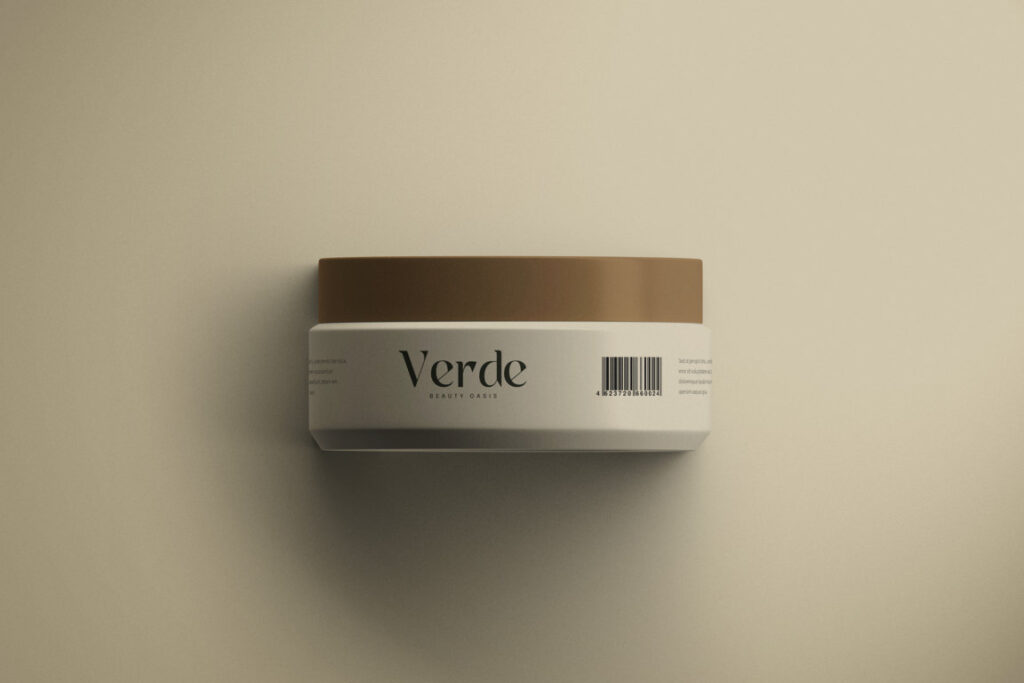
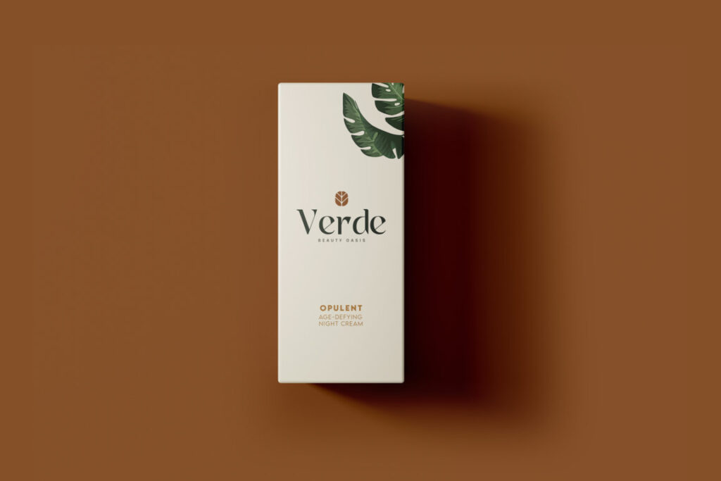
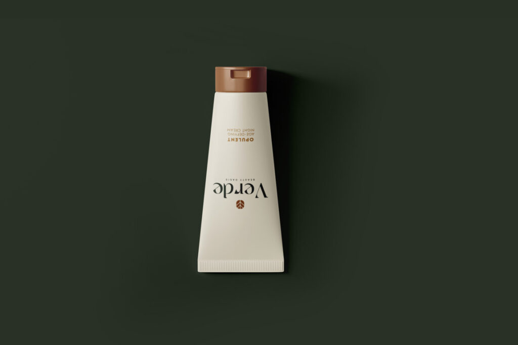
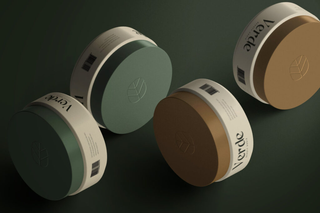
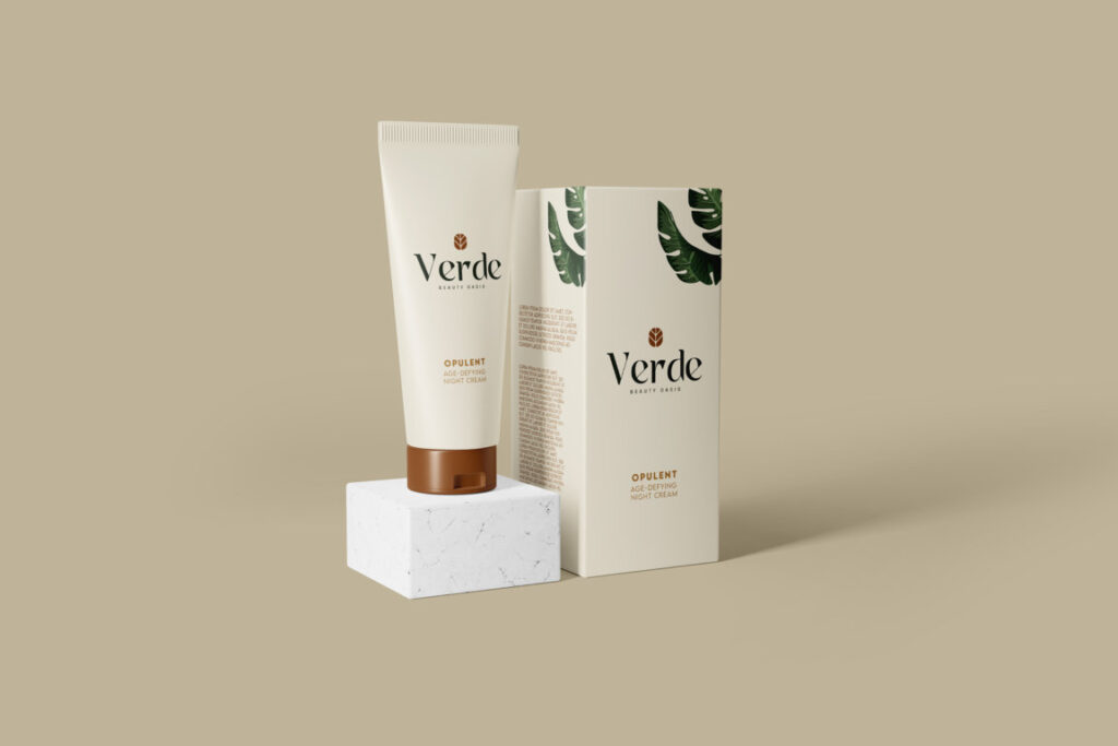
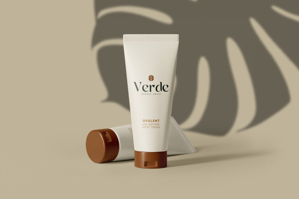
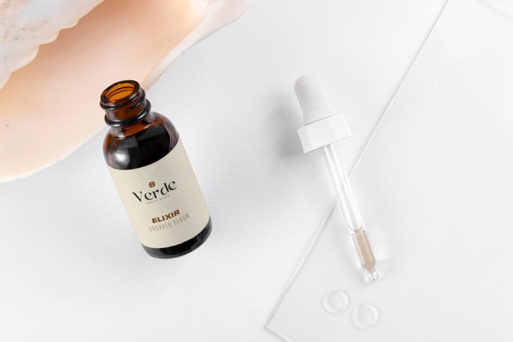
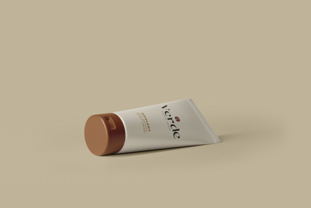
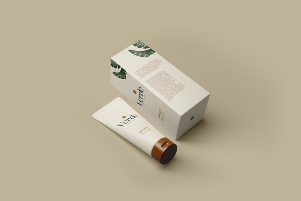
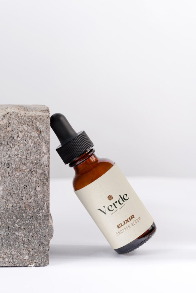
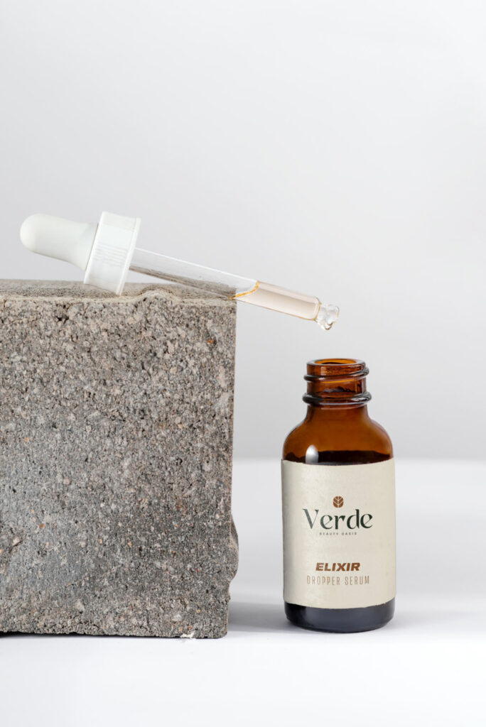
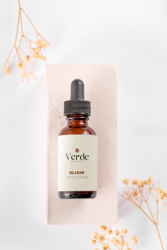
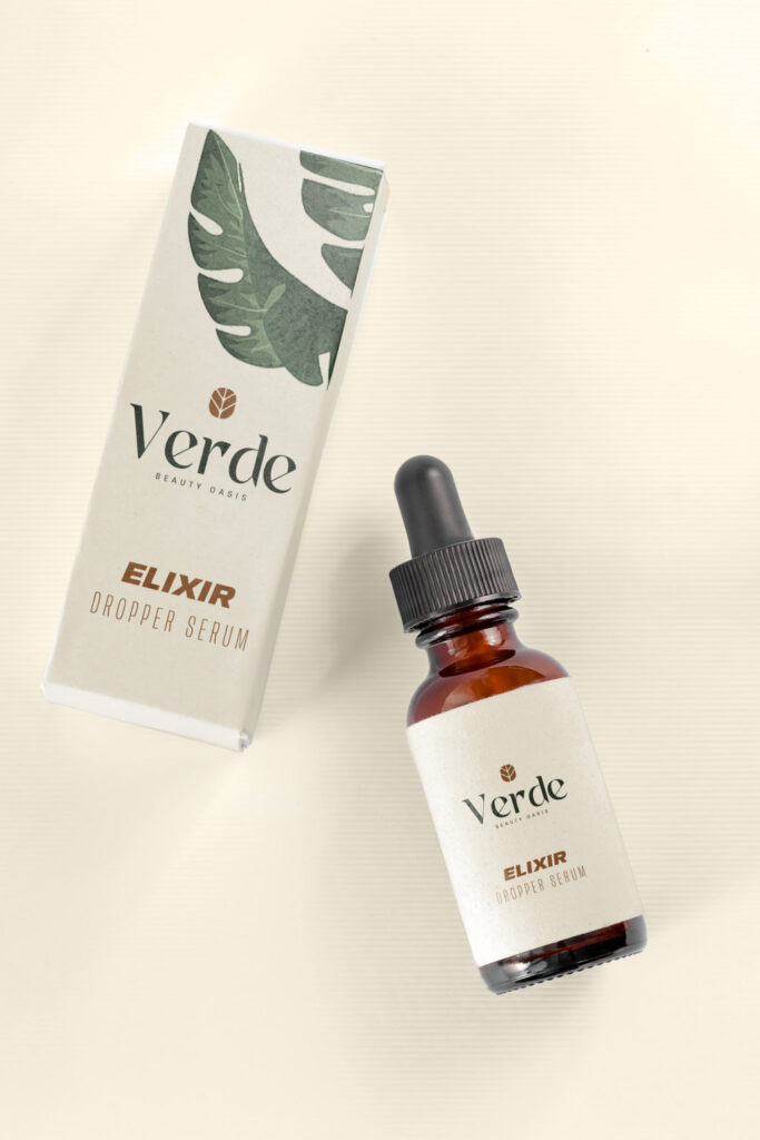
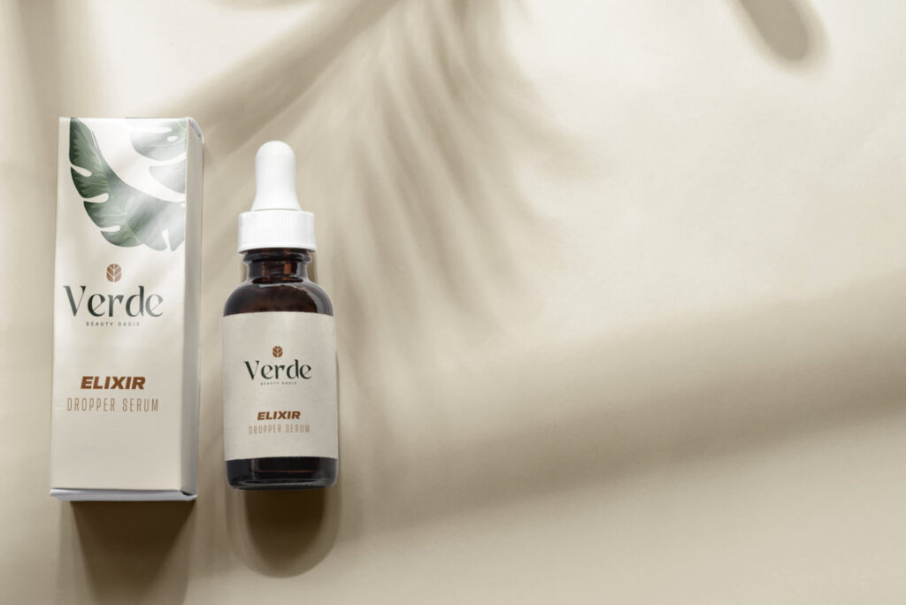
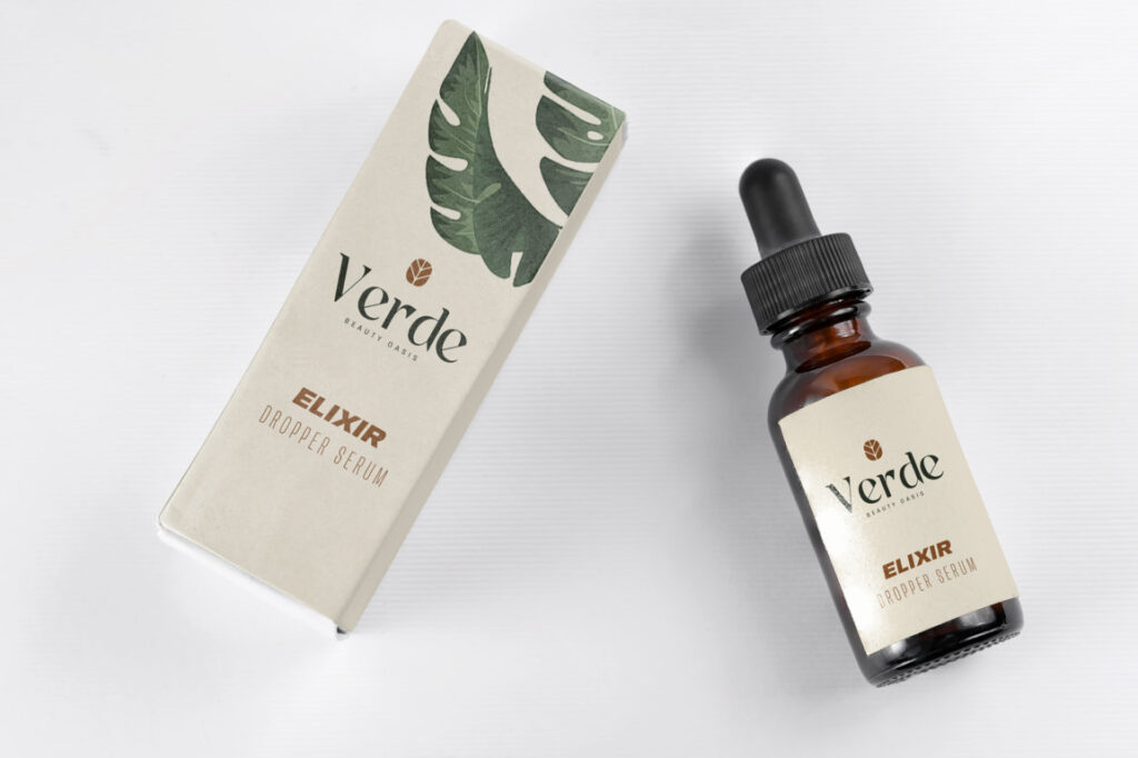
Packaging Design
Visual Identity Development
Lifestyle
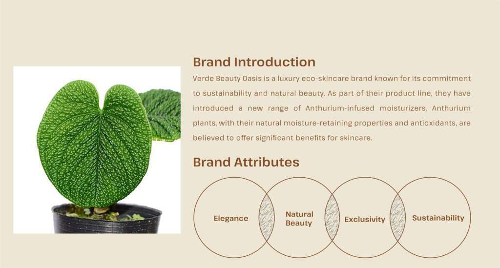
Client Overview: Verde Beauty Oasis is a distinguished luxury eco-skincare brand renowned for its commitment to sustainable practices and natural beauty solutions. Despite its stellar reputation, the brand faced a significant challenge: its visual identity did not fully encapsulate its core values of sustainability and luxury. To address this, the brand sought a comprehensive rebranding effort to realign its image with its ethos and resonate more deeply with its discerning clientele.
Approach: The rebranding initiative began with a thorough clarity session aimed at understanding the essence of Verde Beauty Oasis and its aspirations. This session unearthed valuable insights into the brand’s values, target audience preferences, and competitive landscape. Armed with this knowledge, the design process commenced with a clear creative brief outlining the objectives and parameters of the project.
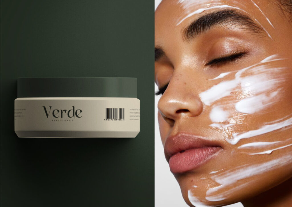
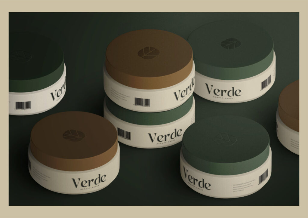
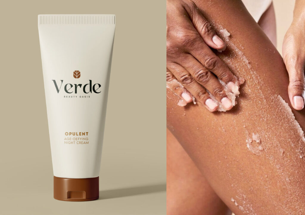
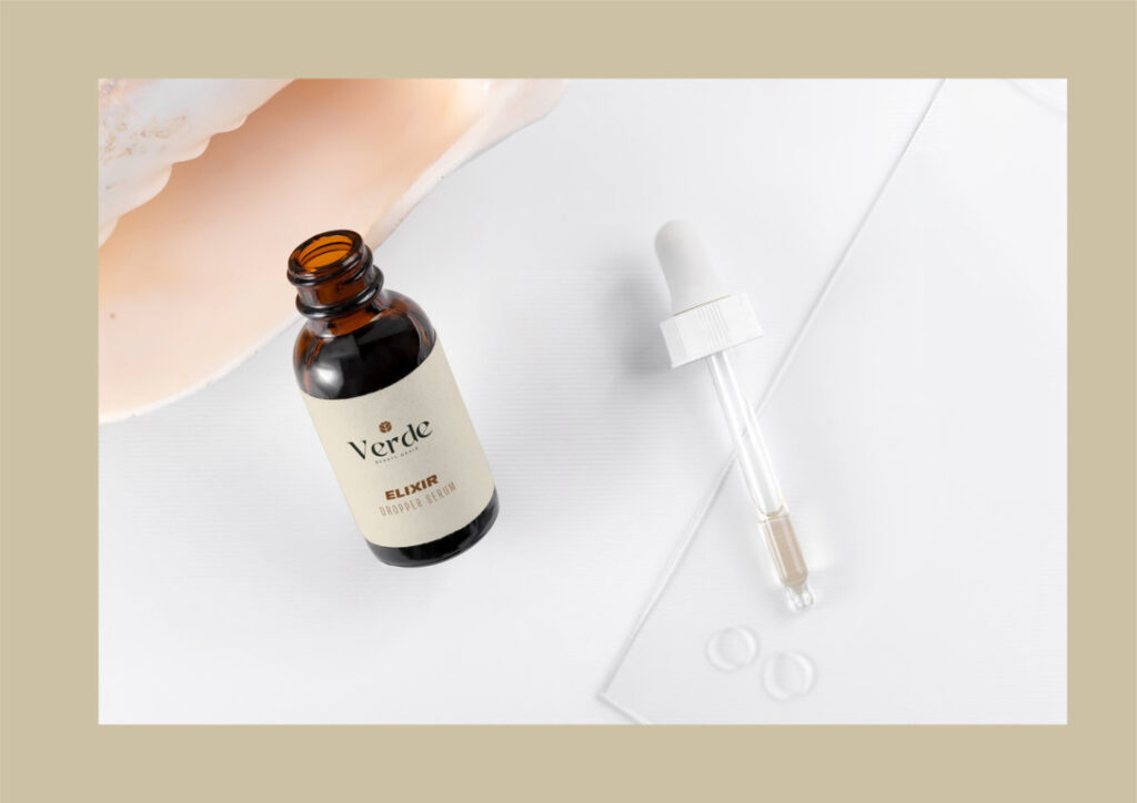

Brand Identity Strategy
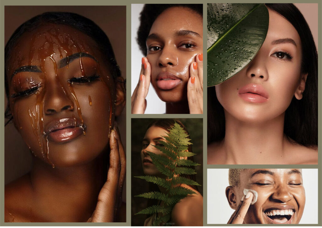
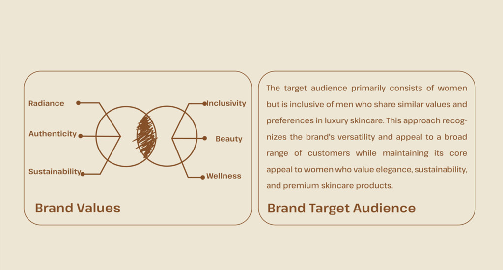
The strategy development process for Verde Beauty Oasis involved a holistic approach, starting with a clarity session to define the brand’s essence and values. Extensive market research and competitor analysis provided insights into industry trends and consumer preferences. Target audience analysis led to the creation of detailed buyer personas, guiding brand positioning and messaging. Visual identity exploration resulted in concepts aligned with sustainability, luxury, and natural beauty. Brand guidelines ensured consistency in brand representation. Feedback and iteration refined the strategy iteratively, leading to the creation of a comprehensive implementation plan. Continuous monitoring and optimization processes were established to measure success and adapt to market changes, ultimately laying the foundation for a successful rebranding effort.
STRATEGY


logo
Logo Design
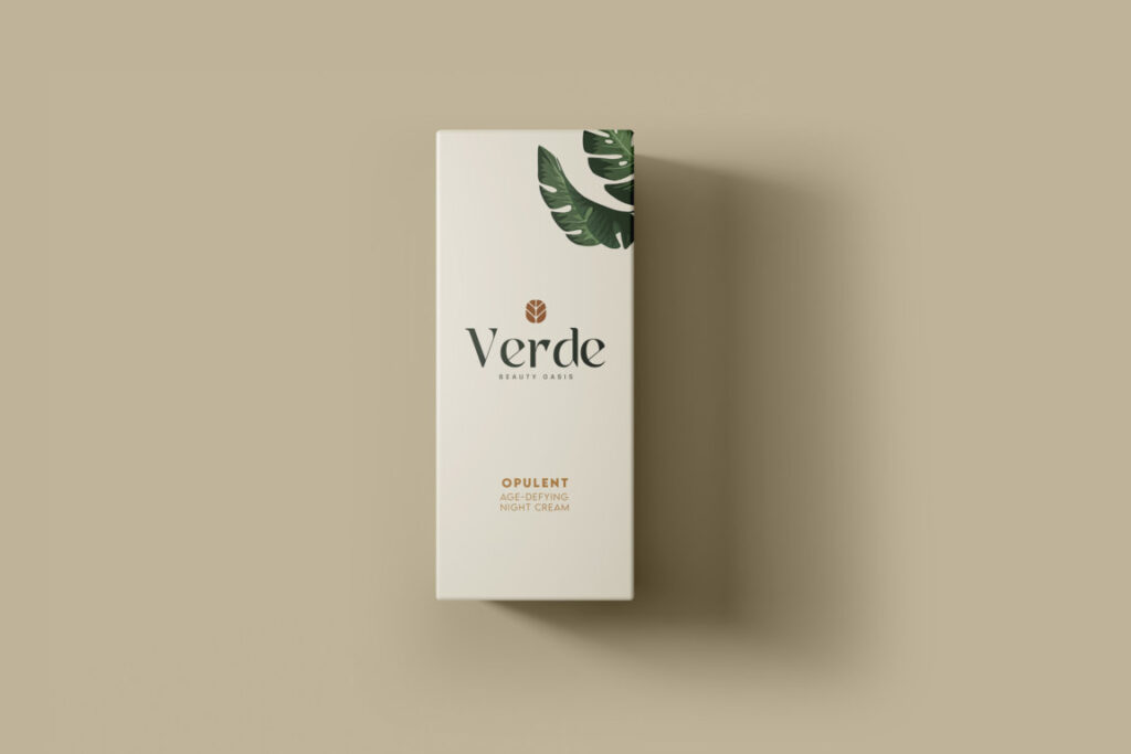
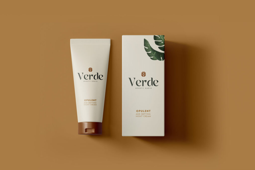
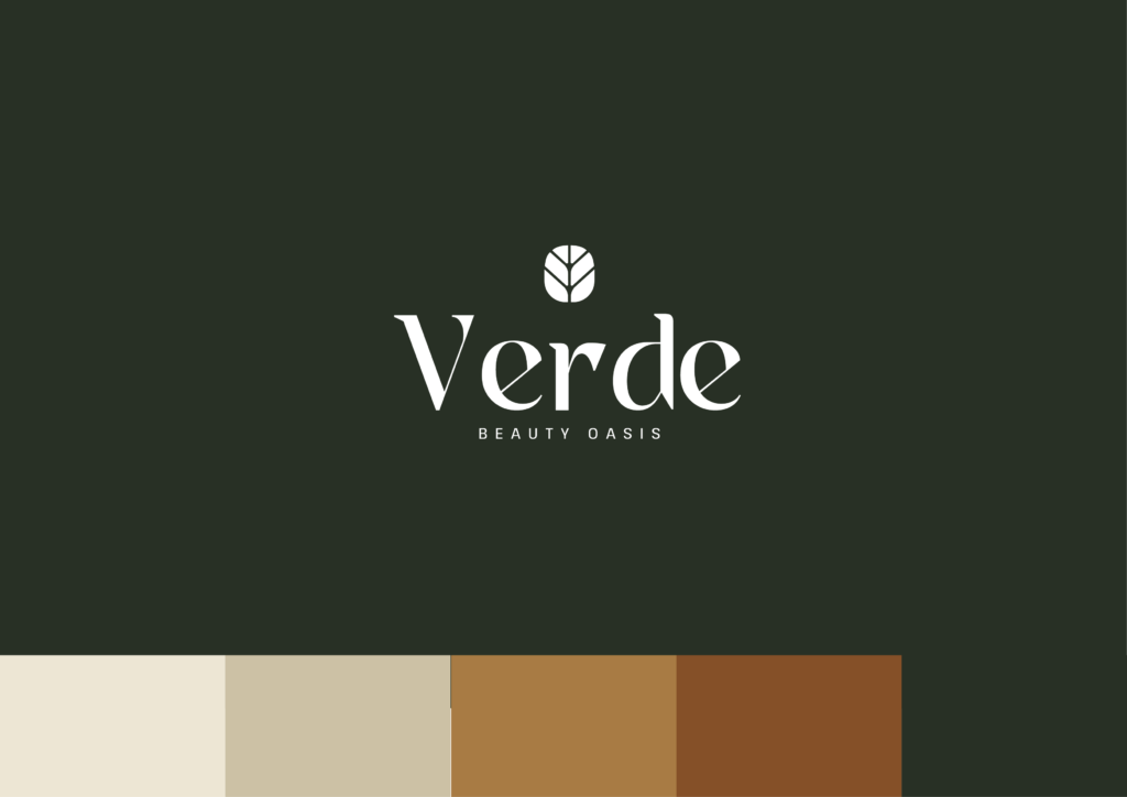
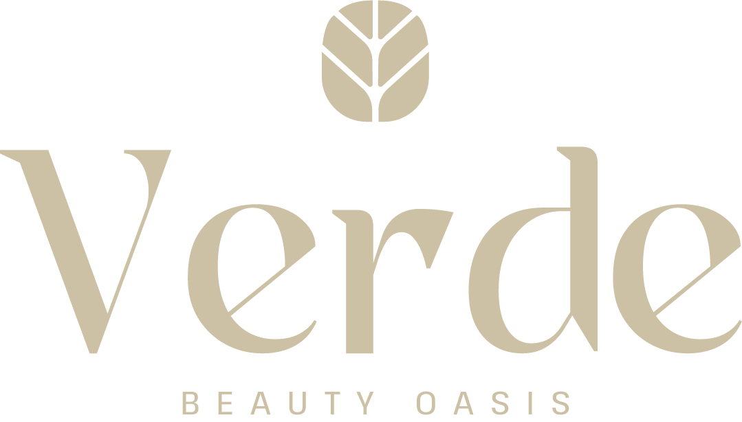
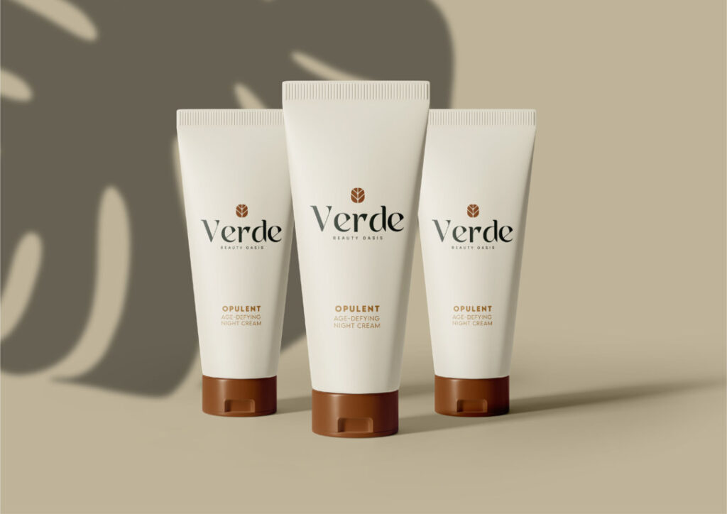
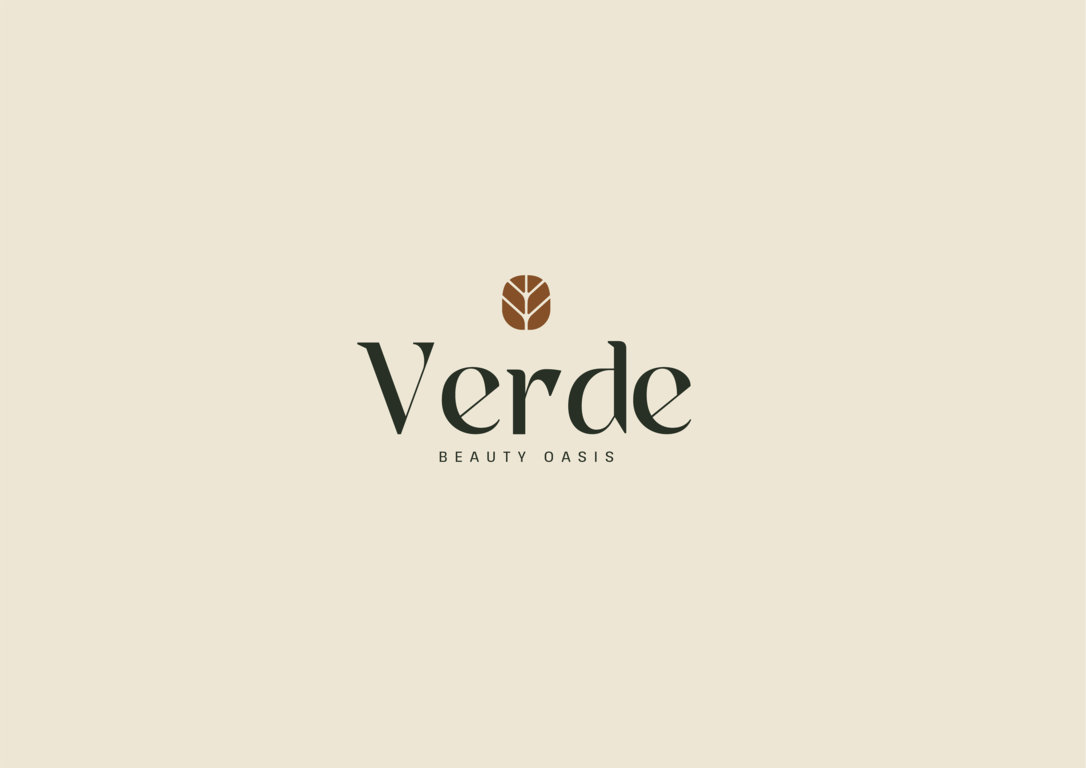
The logo for Verde Beauty Oasis embodies the brand’s commitment to sustainability, luxury, and natural beauty. It features a delicate leaf motif, symbolizing growth, vitality, and the organic origins of the brand’s skincare products. The leaf is elegantly stylized, with subtle curves and intricate details that evoke a sense of refinement and sophistication. Paired with minimalist typography, the logo exudes a timeless aesthetic that resonates with the brand’s discerning clientele. Earthy tones and muted colors evoke nature’s palette, further reinforcing the brand’s connection to the environment. Overall, the logo serves as a visual representation of Verde Beauty Oasis’s ethos, capturing the essence of sustainable luxury and natural beaut
Color
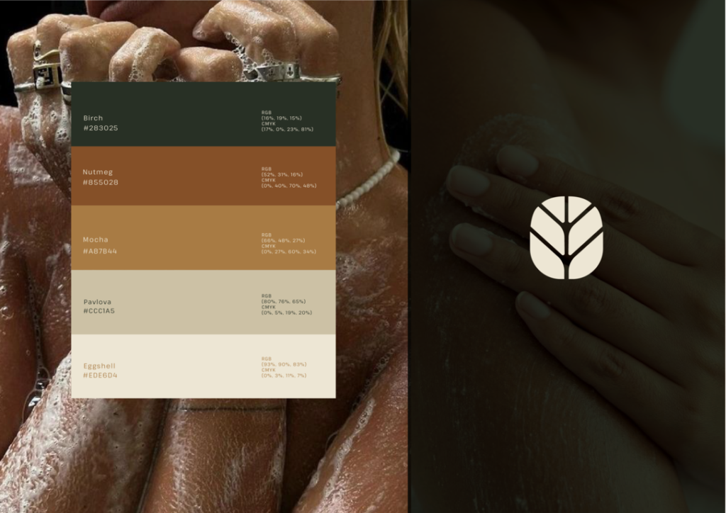
Color played a pivotal role in the rebranding effort for Verde Beauty Oasis. Inspired by the lush greenery of nature and the opulence of luxury, a palette of rich, earthy tones was carefully selected to evoke a sense of elegance and sustainability.
The primary color, a deep emerald green, symbolizes growth, harmony, and the rejuvenating power of nature. It serves as the foundation of the brand’s visual identity, grounding it in its commitment to sustainability and environmental consciousness.
Complementing this verdant hue are accents of gold, representing luxury, sophistication, and timeless beauty. These accents add a touch of opulence to the brand’s identity, reinforcing its status as a premium skincare destination.
Together, the harmonious interplay of green and gold creates a visual identity that is both striking and evocative, inviting consumers into a world where beauty and sustainability coexist in perfect harmony.
Typography
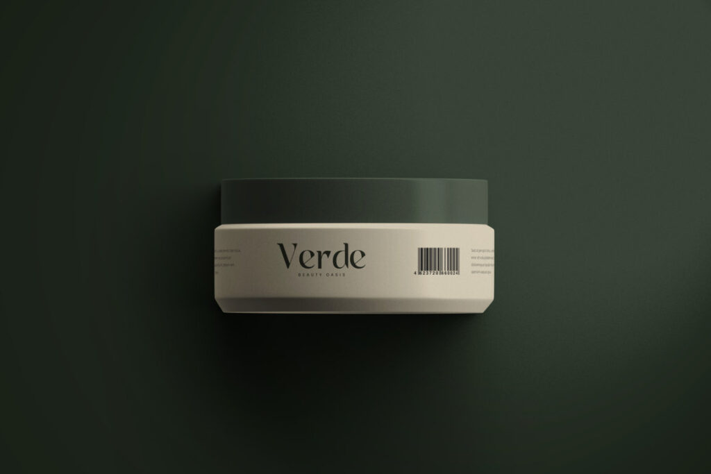
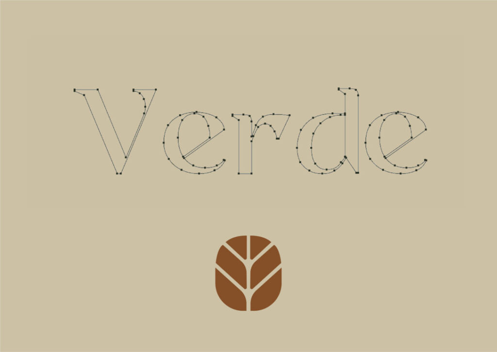
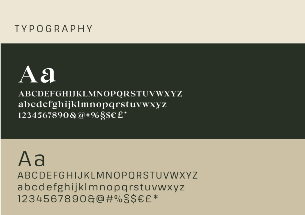
Verde Beauty Oasis employs a strategic blend of serif and sans-serif typography in its branding to convey a harmonious balance between tradition and modernity, sophistication and simplicity. The serif typeface used in the logo’s wordmark exudes timeless elegance and luxury, while the sans-serif typeface in supporting text adds a contemporary edge and minimalist appeal. This combination of typographic styles reinforces the brand’s commitment to quality, natural beauty, and innovation, appealing to a diverse audience of discerning consumers.
