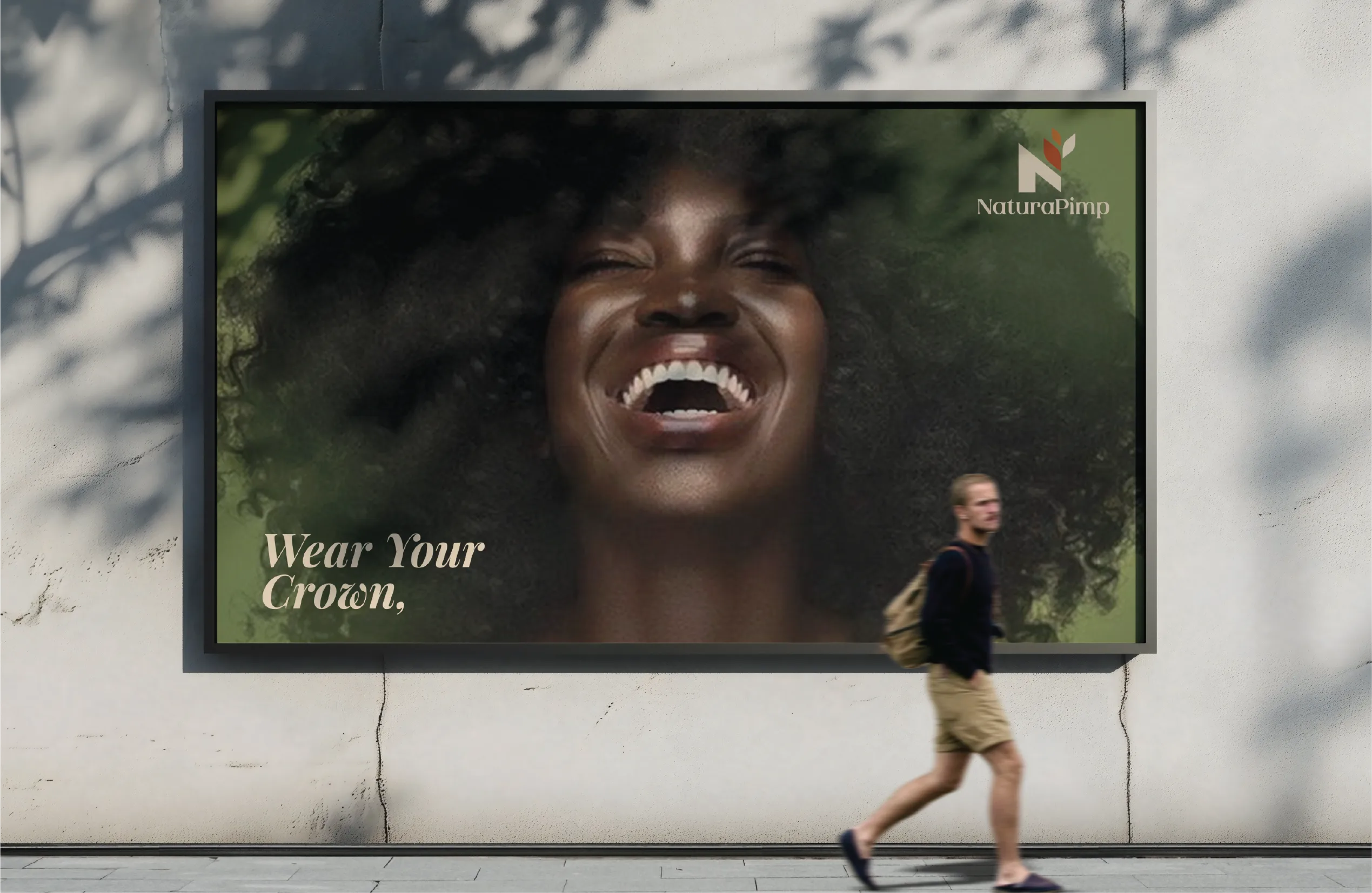
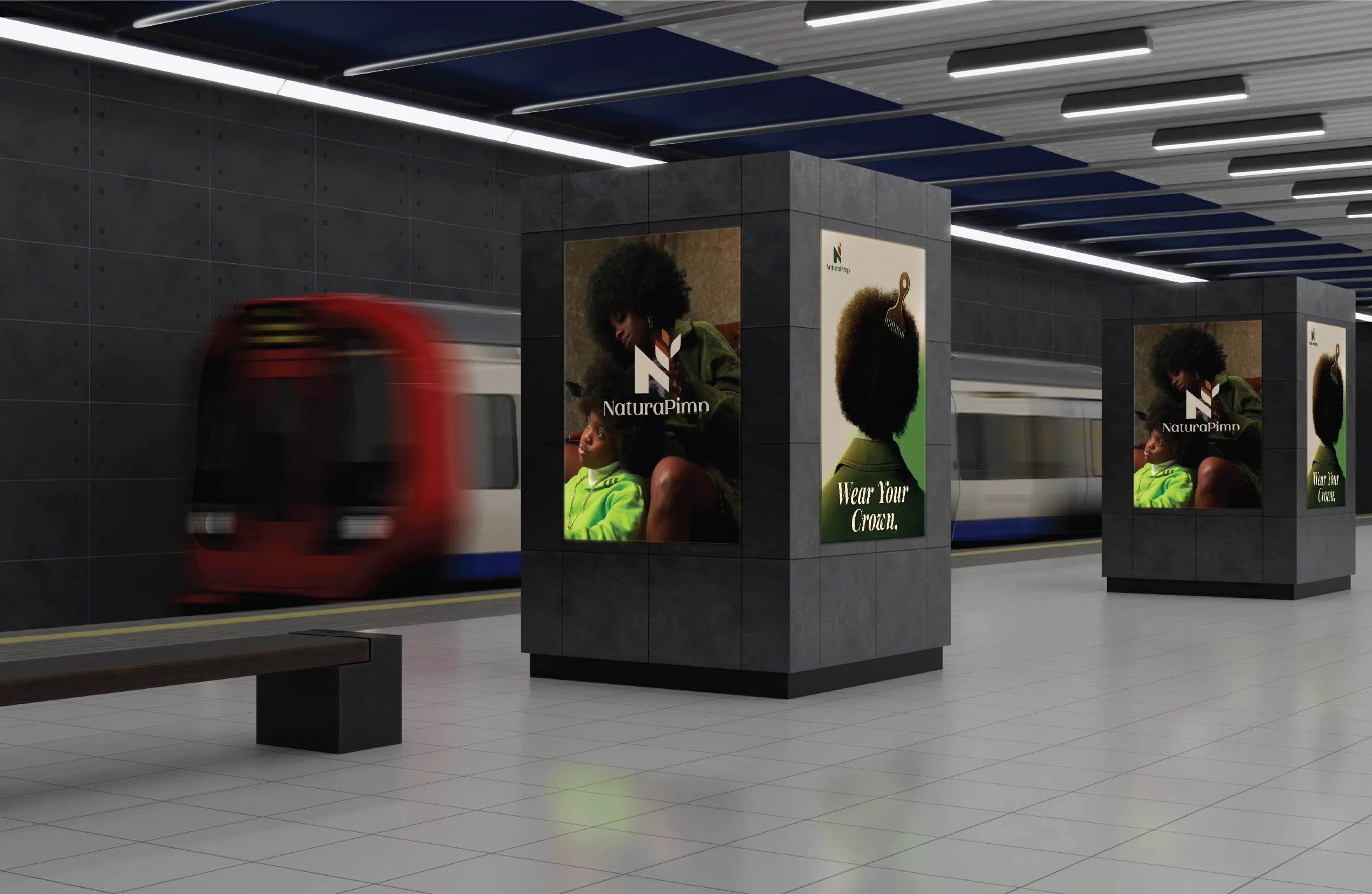
The African haircare market treats natural hair as a problem. Straighten it. Tame it. Smooth it into something else. Natura Pimp rejected that premise. The brand treats natural hair as something to celebrate.
The identity needed to read as permission. Clean was not enough.
The Challenge
The haircare category speaks one language: correction. Natura Pimp needed different words. It needed a stance a customer could stand behind.
I led brand strategy and identity design from concept to execution: positioning, logo, packaging, and the guidelines that hold it together.
The Thinking
Most hair care brands lead with ingredients or results. Natura Pimp led with belief. The idea came first. The product came second. That order shaped the identity. Confidence came before function.
Visual Identity Development
LOGO DESIGN
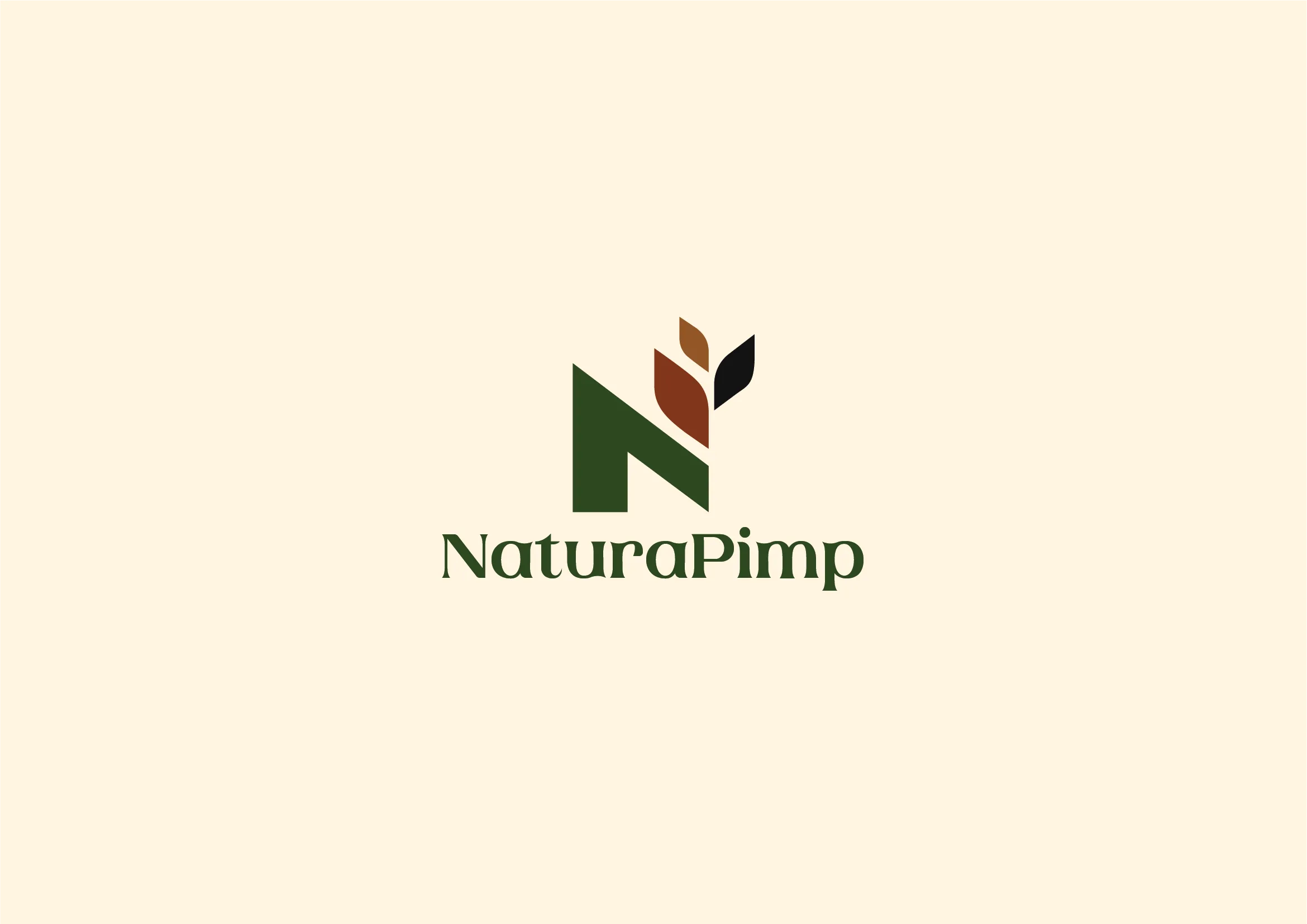
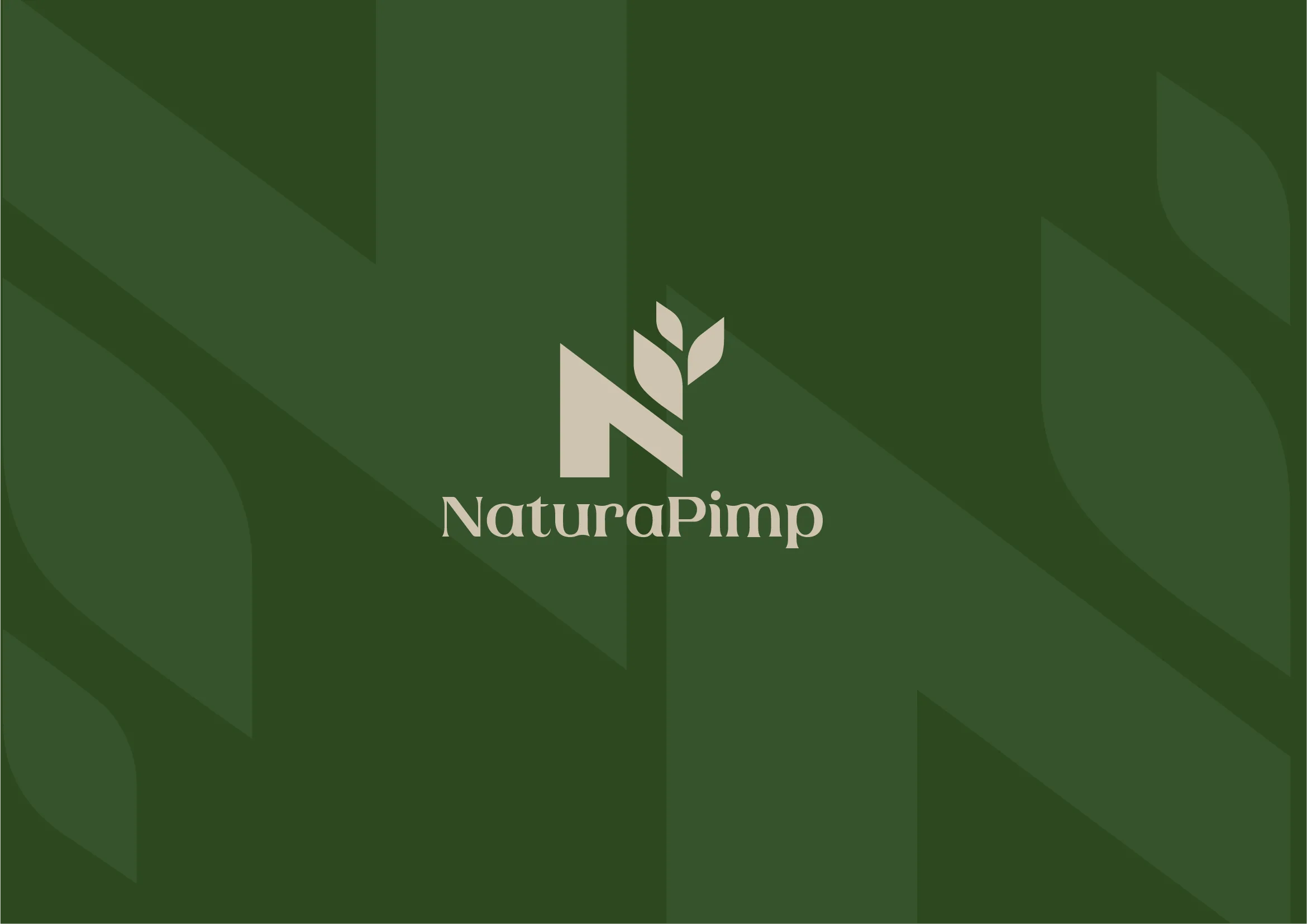
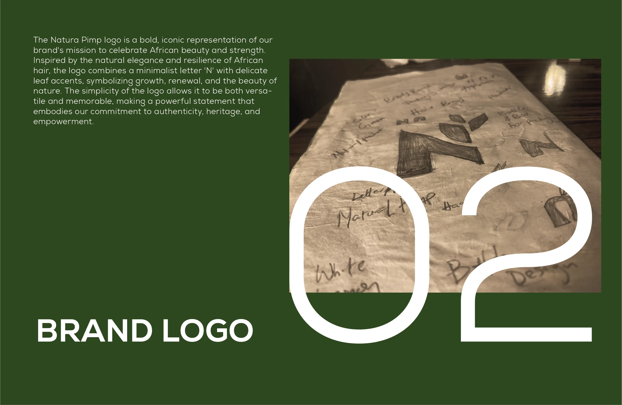
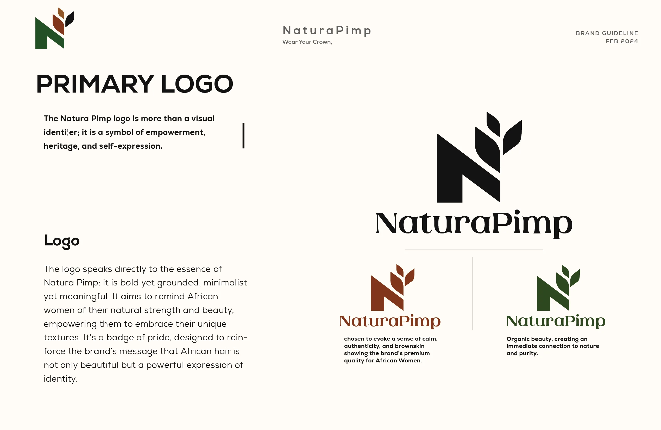
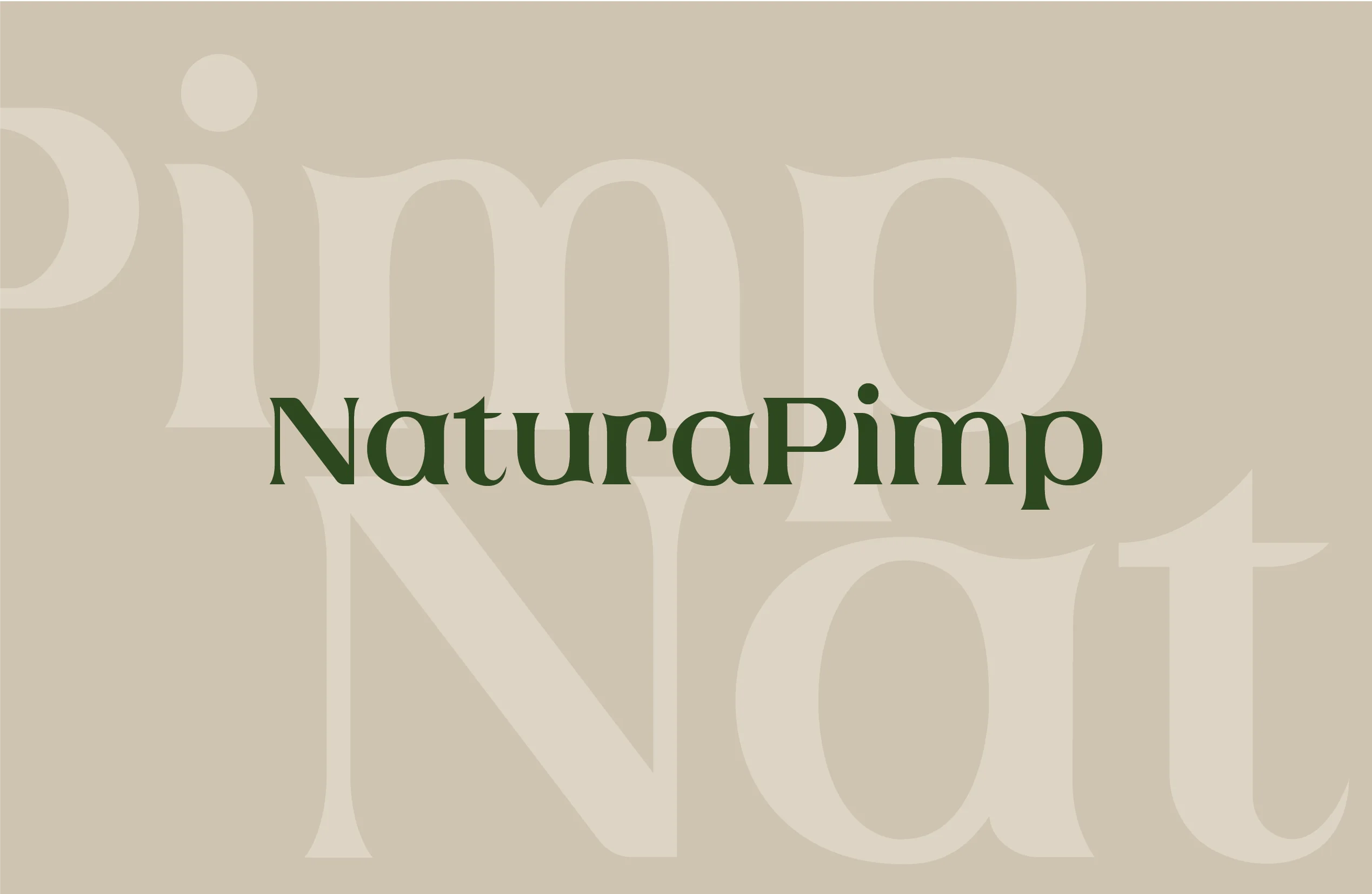
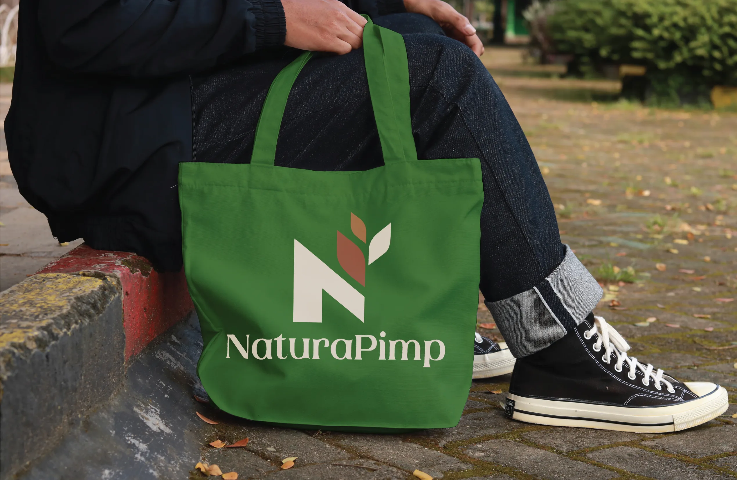
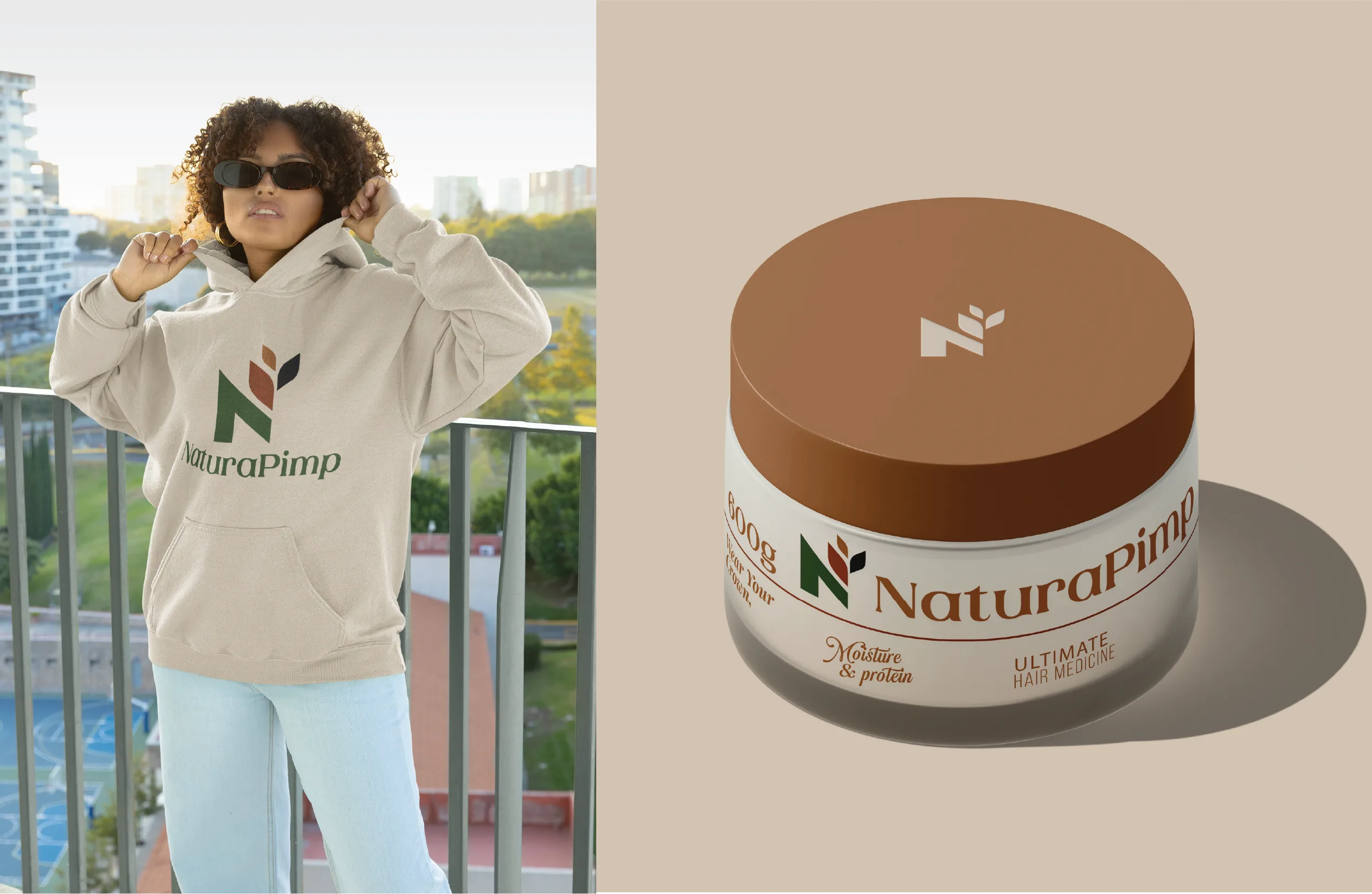
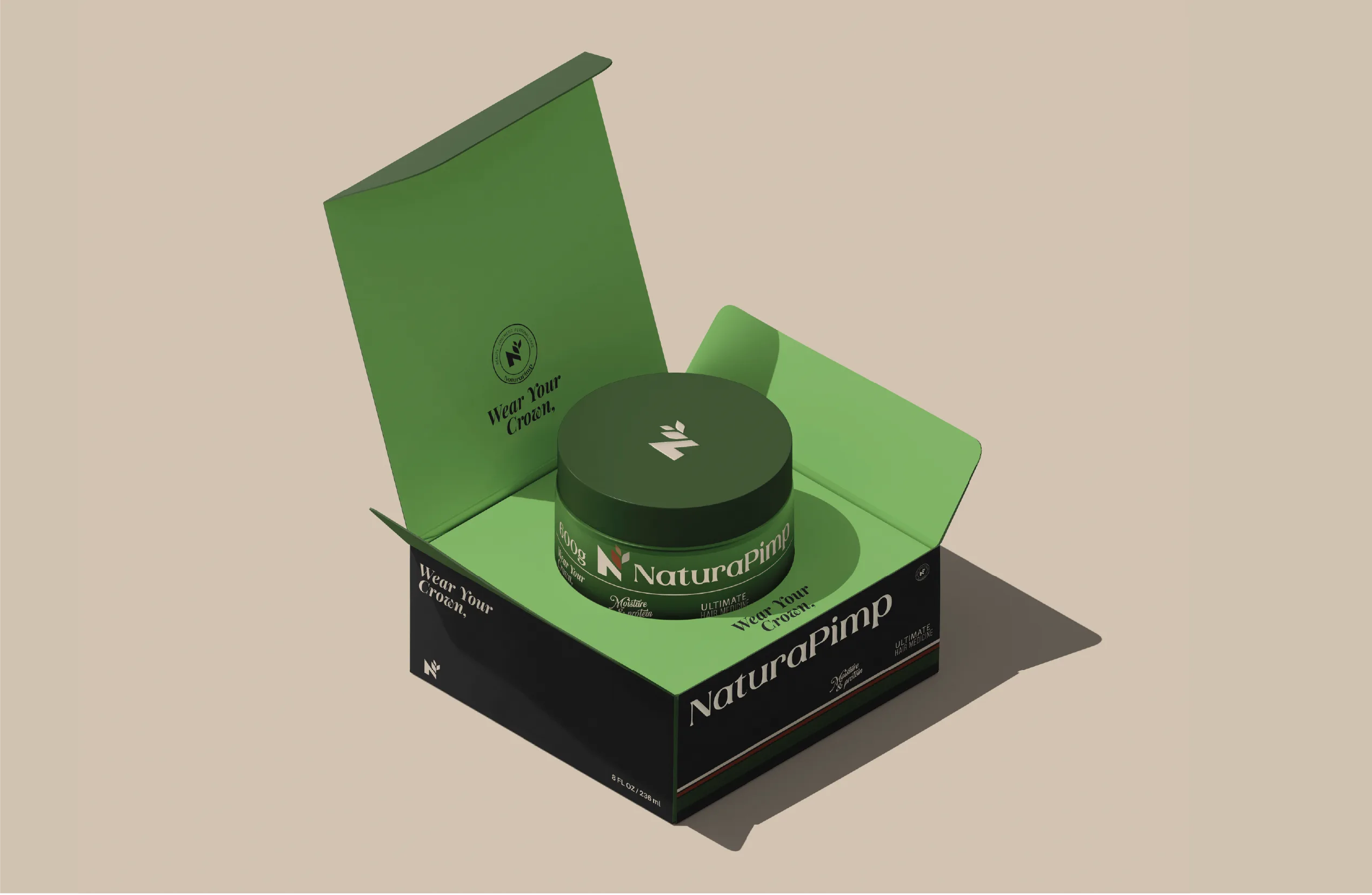
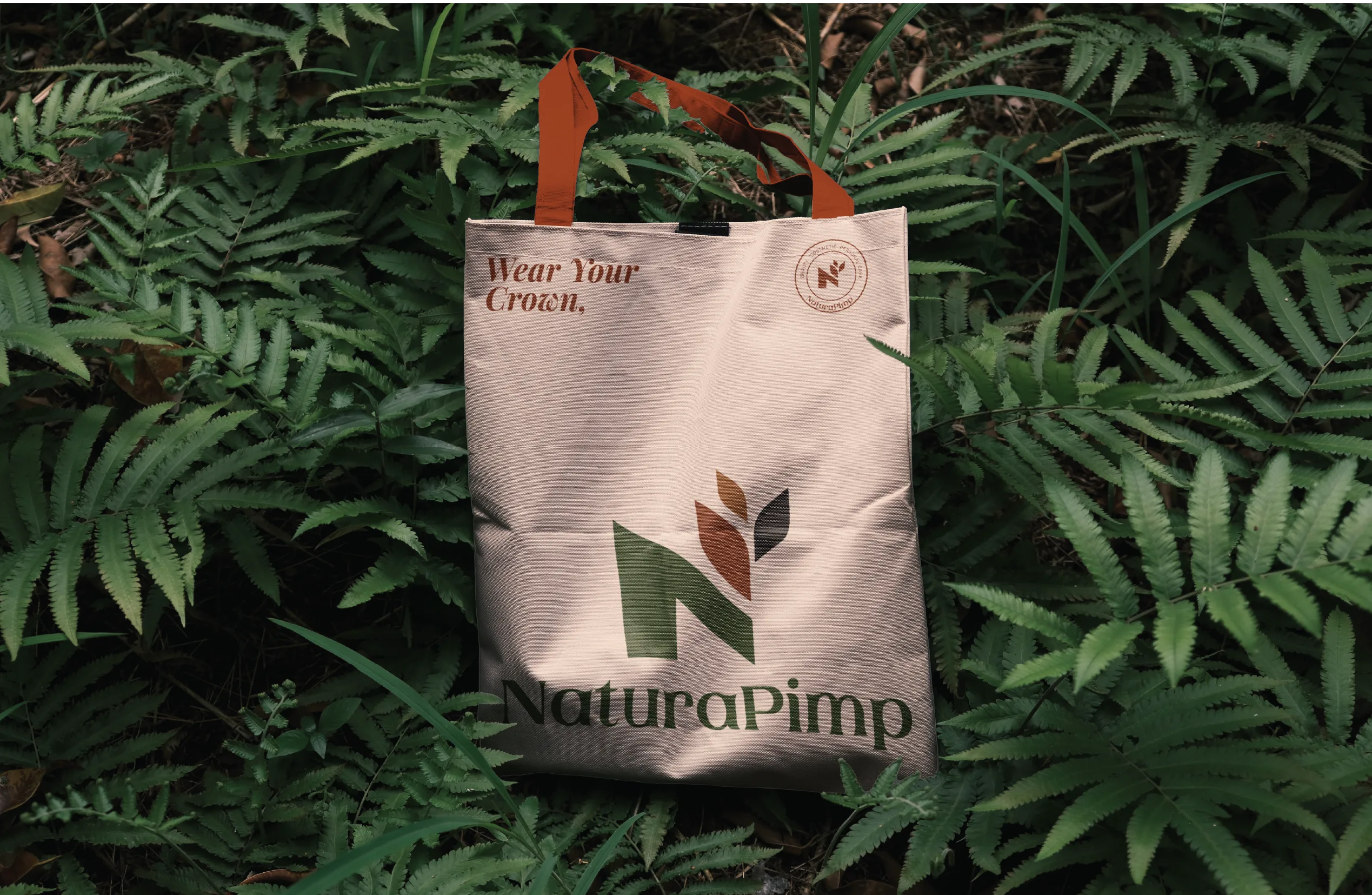
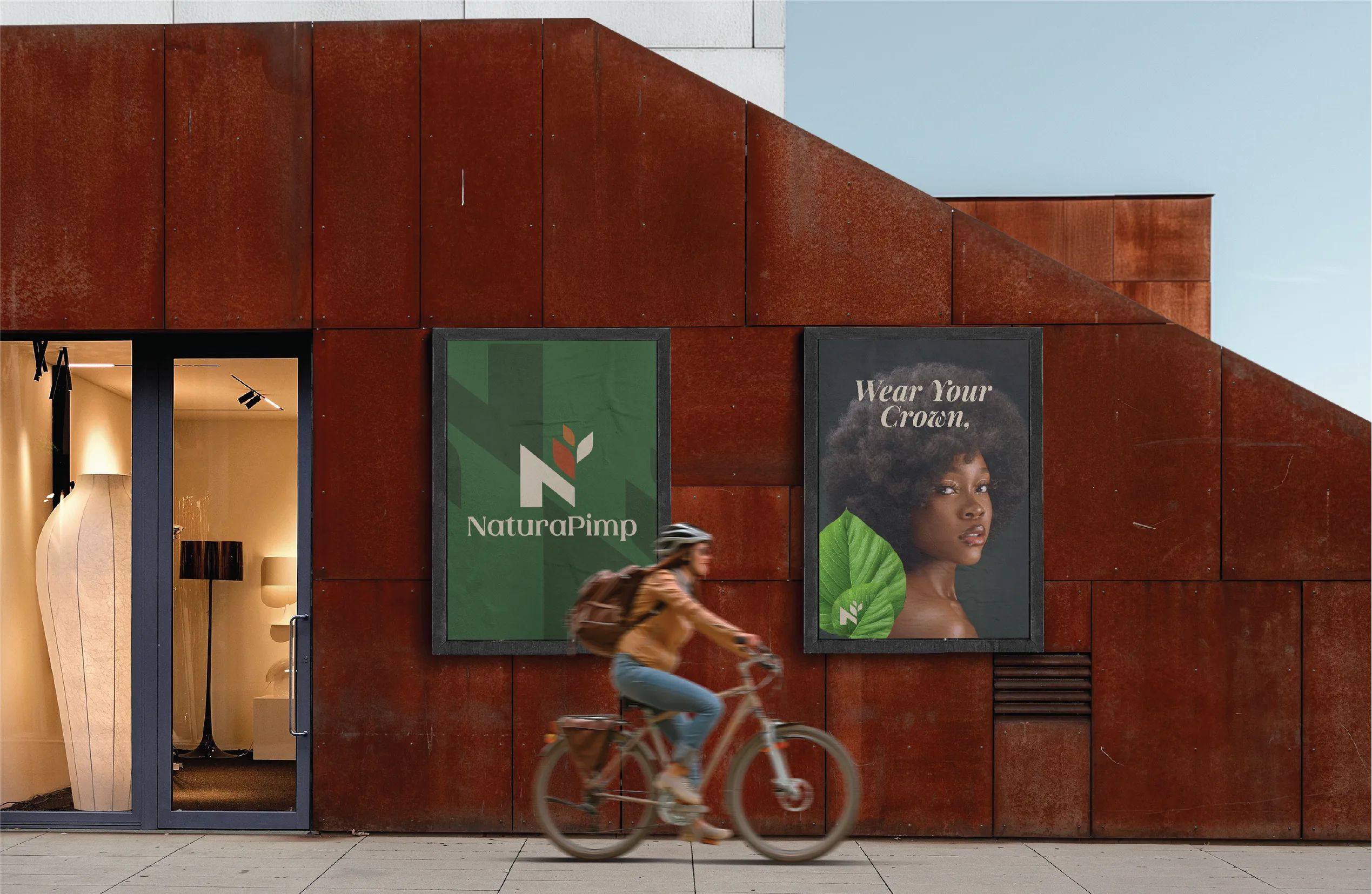
The mark pairs a stylized letter N with a leaf form. Simple enough to read at a glance. Specific enough to feel intentional. Growth and nature aren’t decoration. They argue that natural hair is a strength.
Color
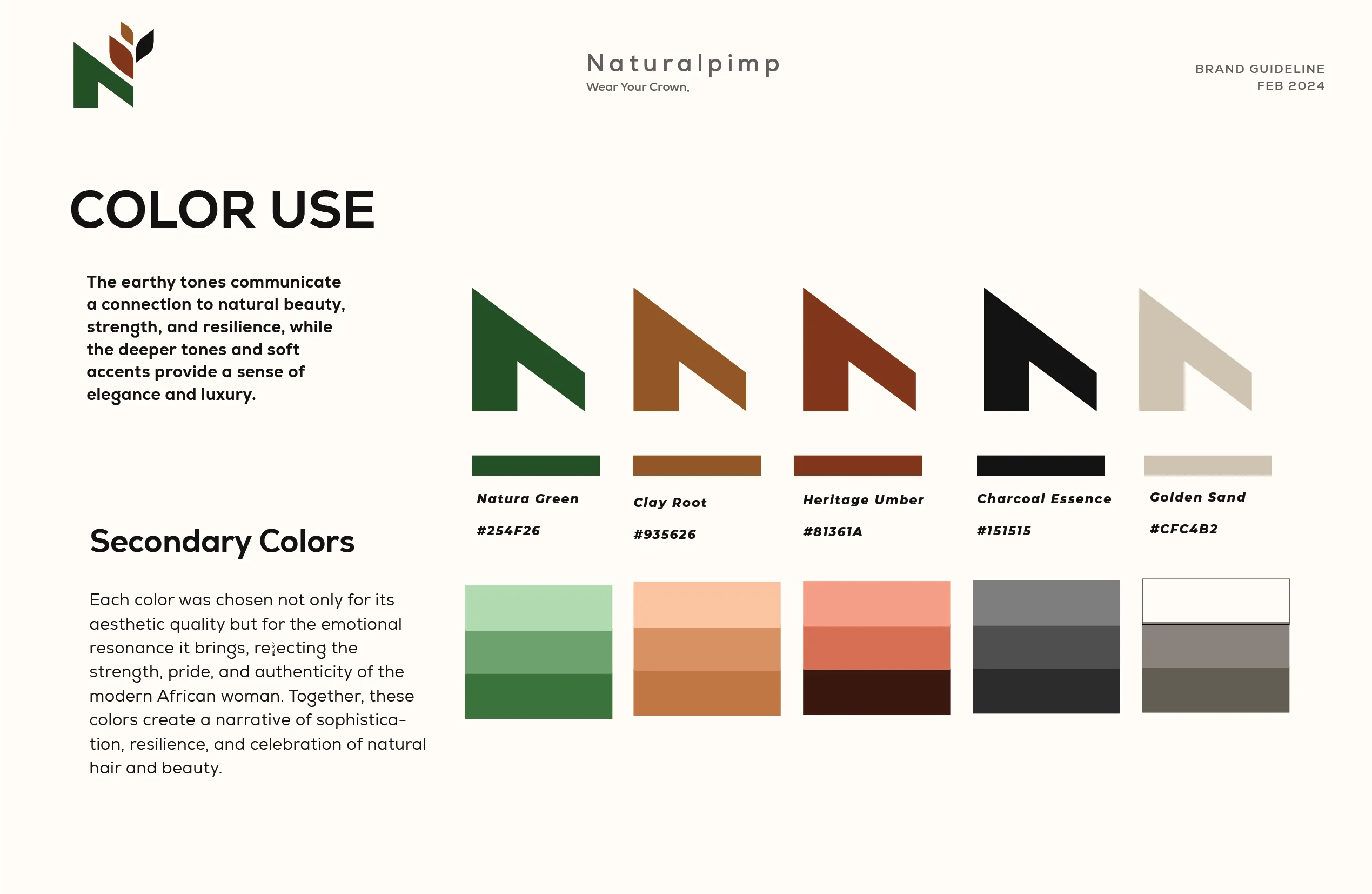
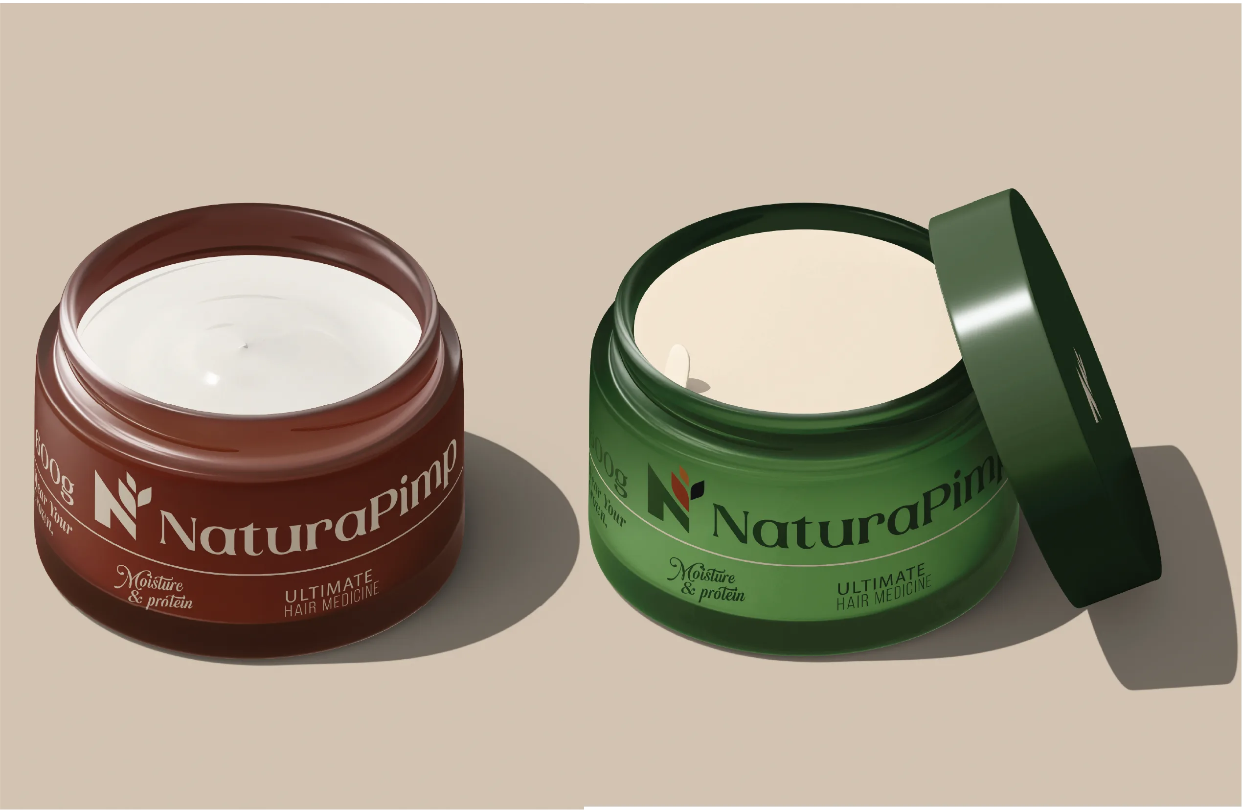
Greens and earth tones, warm instead of clinical. Most hair care in this category leans on sterile whites for correction and science, or oversaturated brights for hype. Natura Pimp needed neither. The palette had to feel grown.
Packaging Design
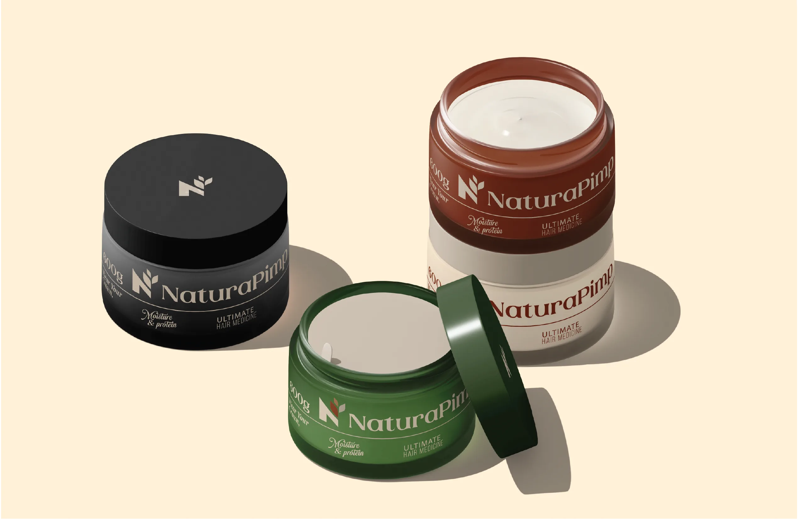
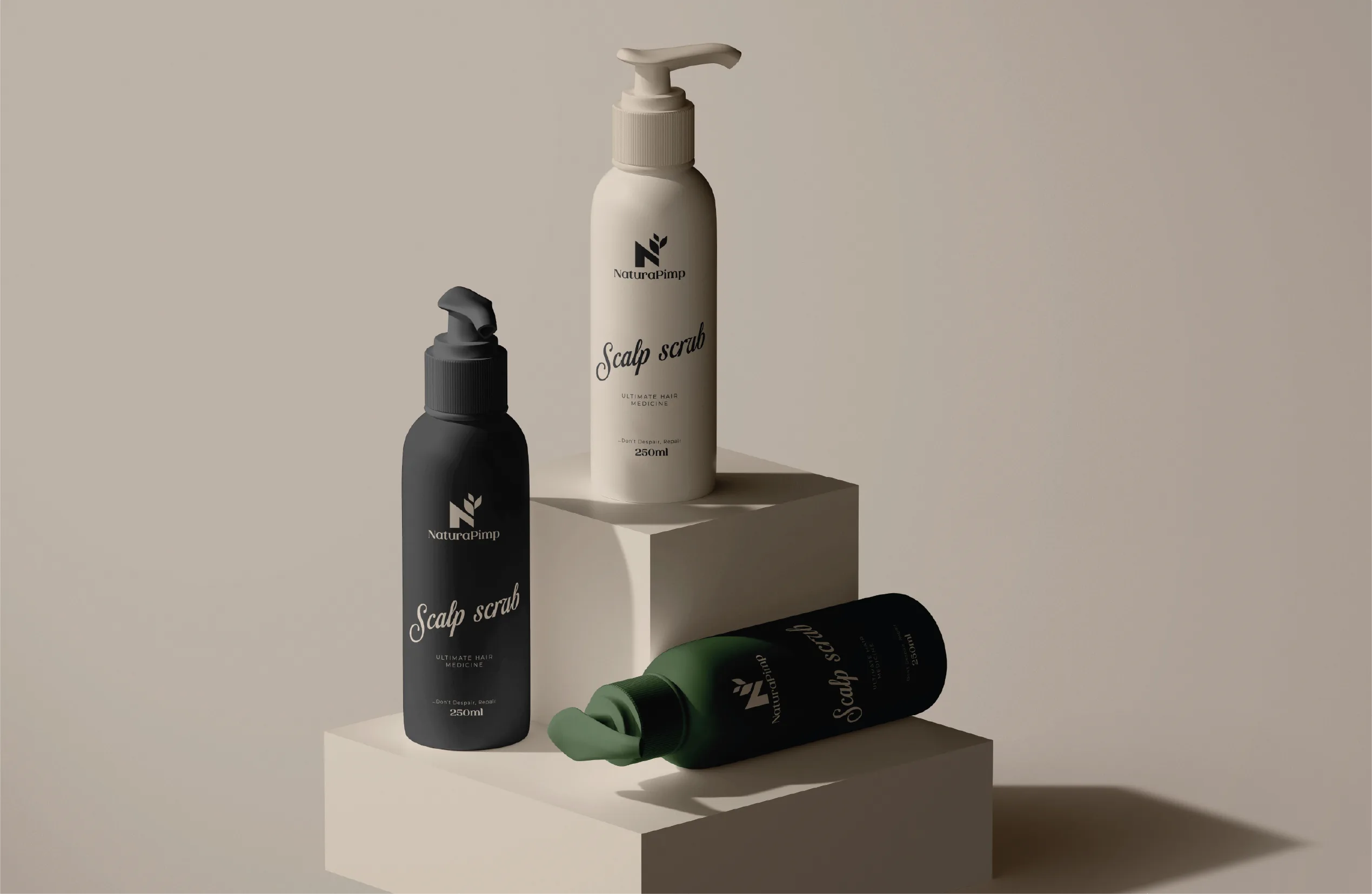
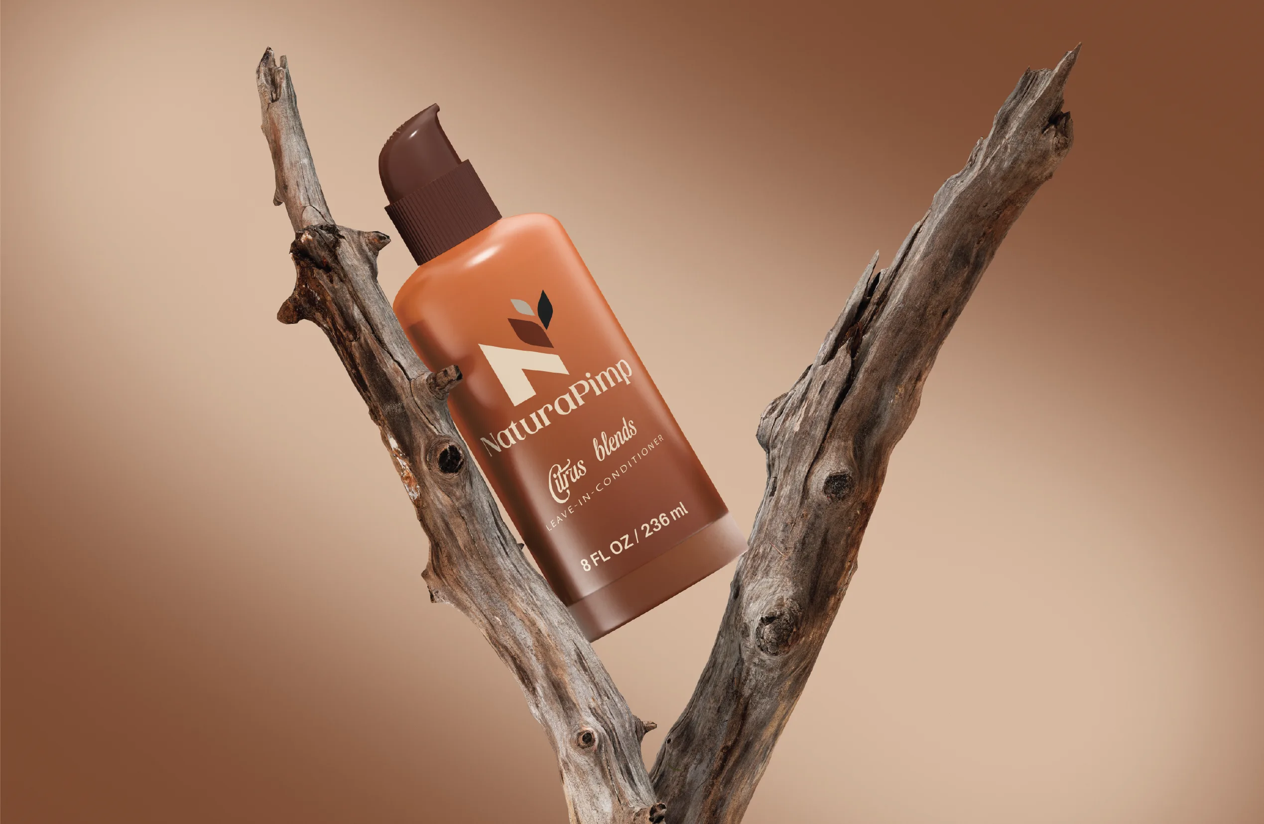
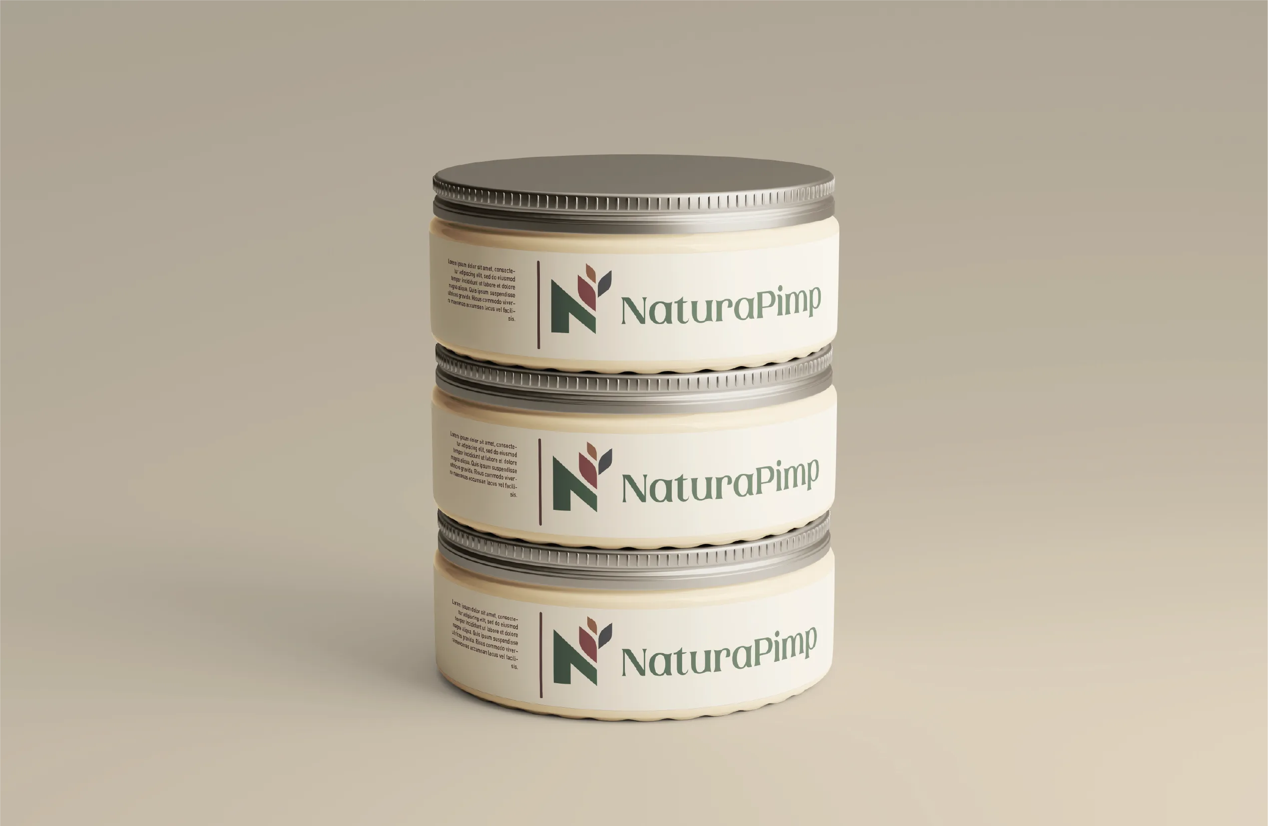
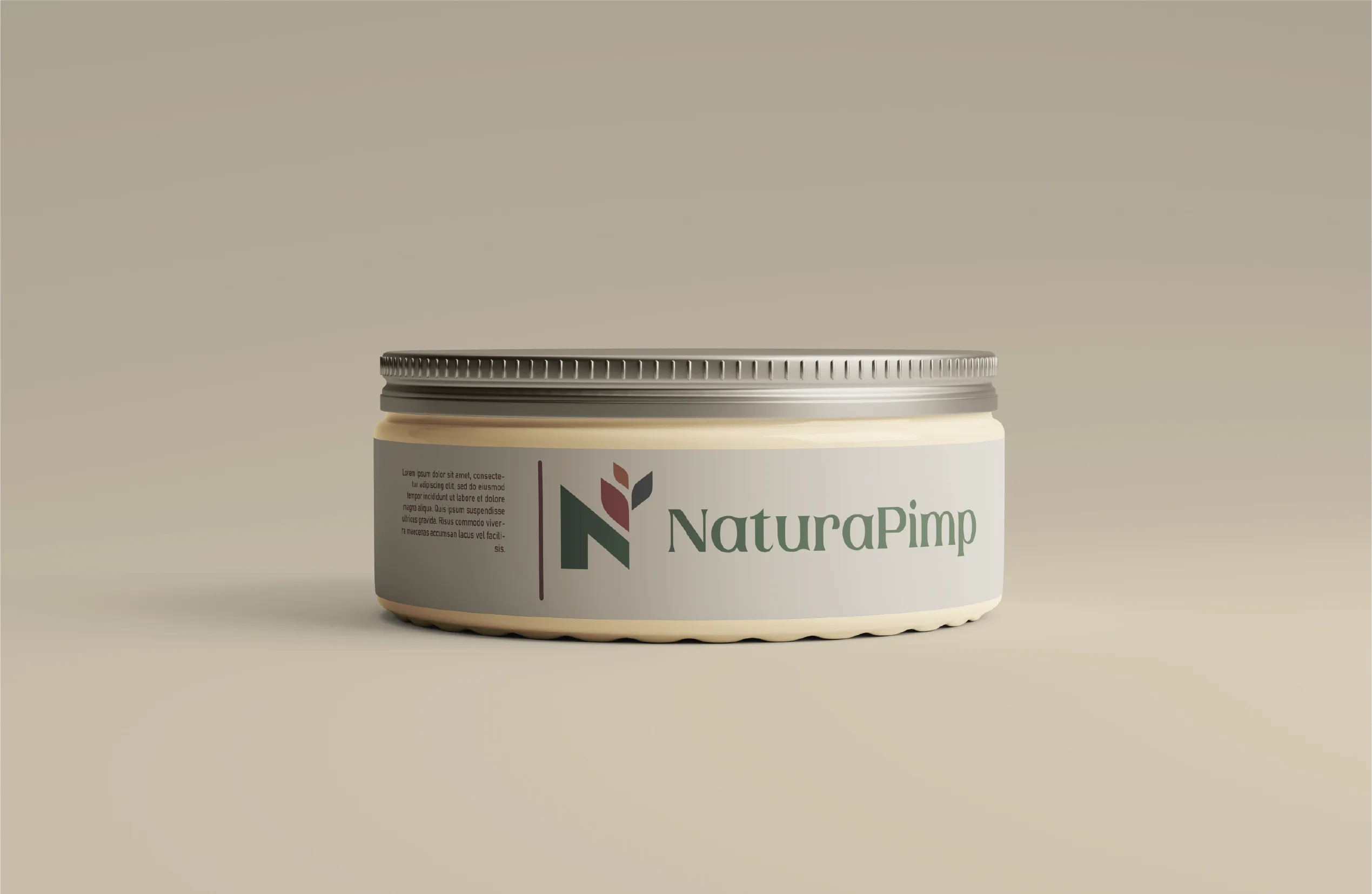
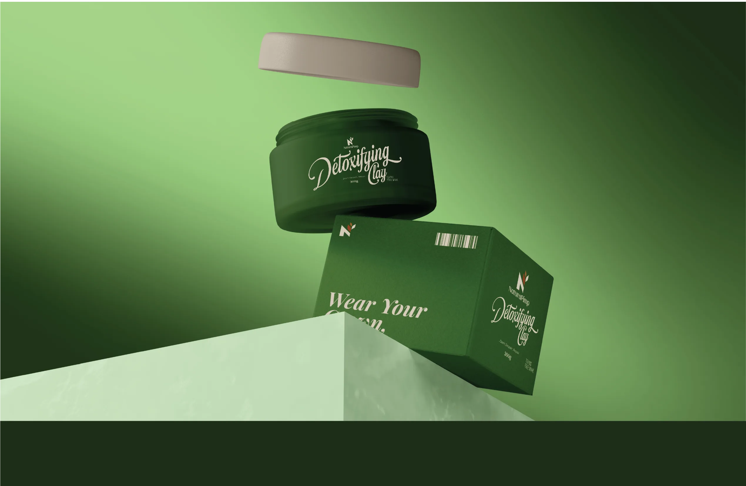
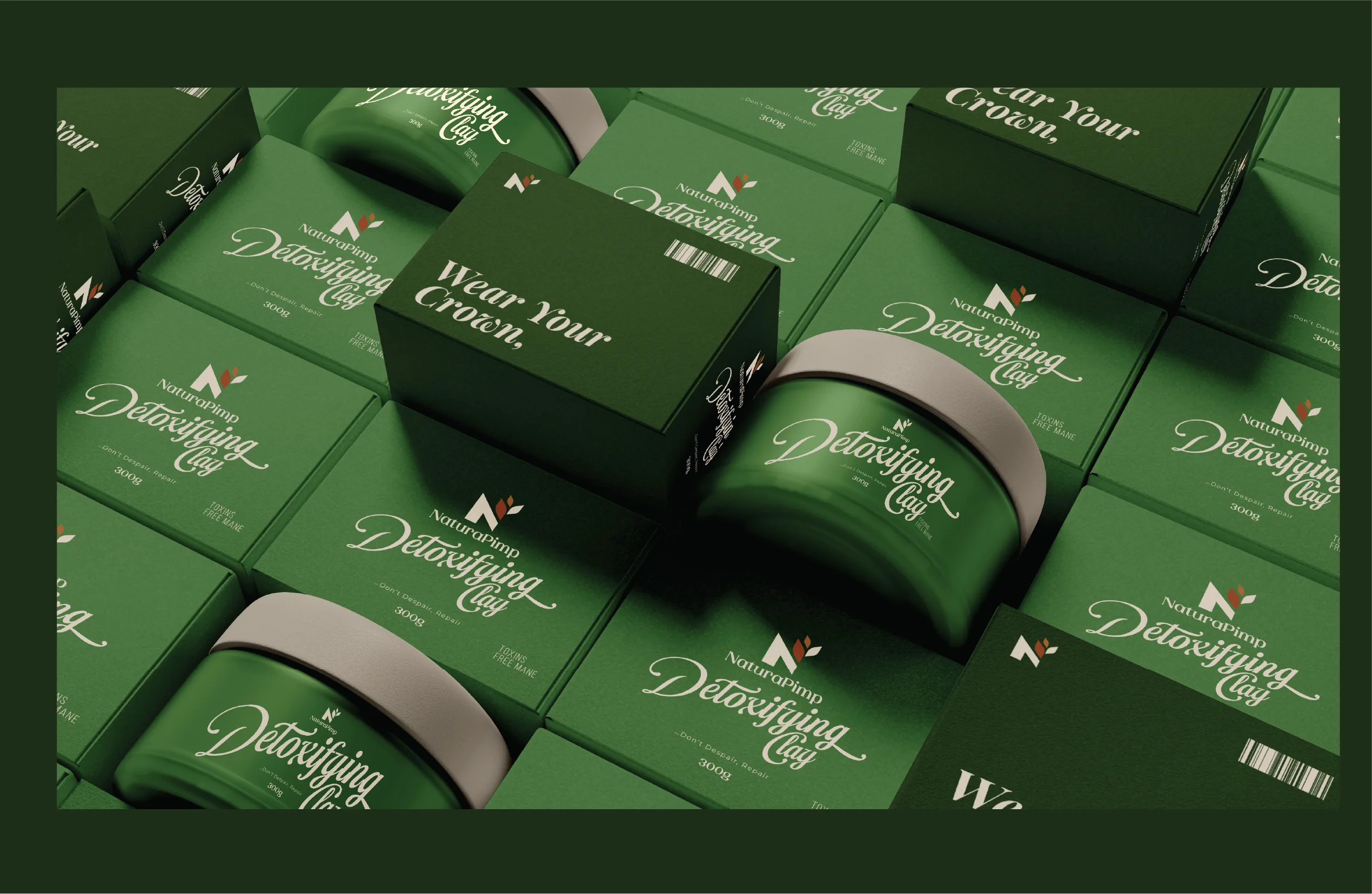
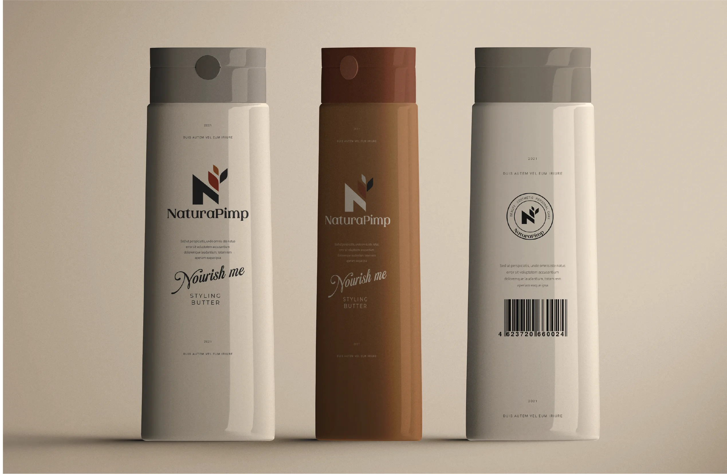
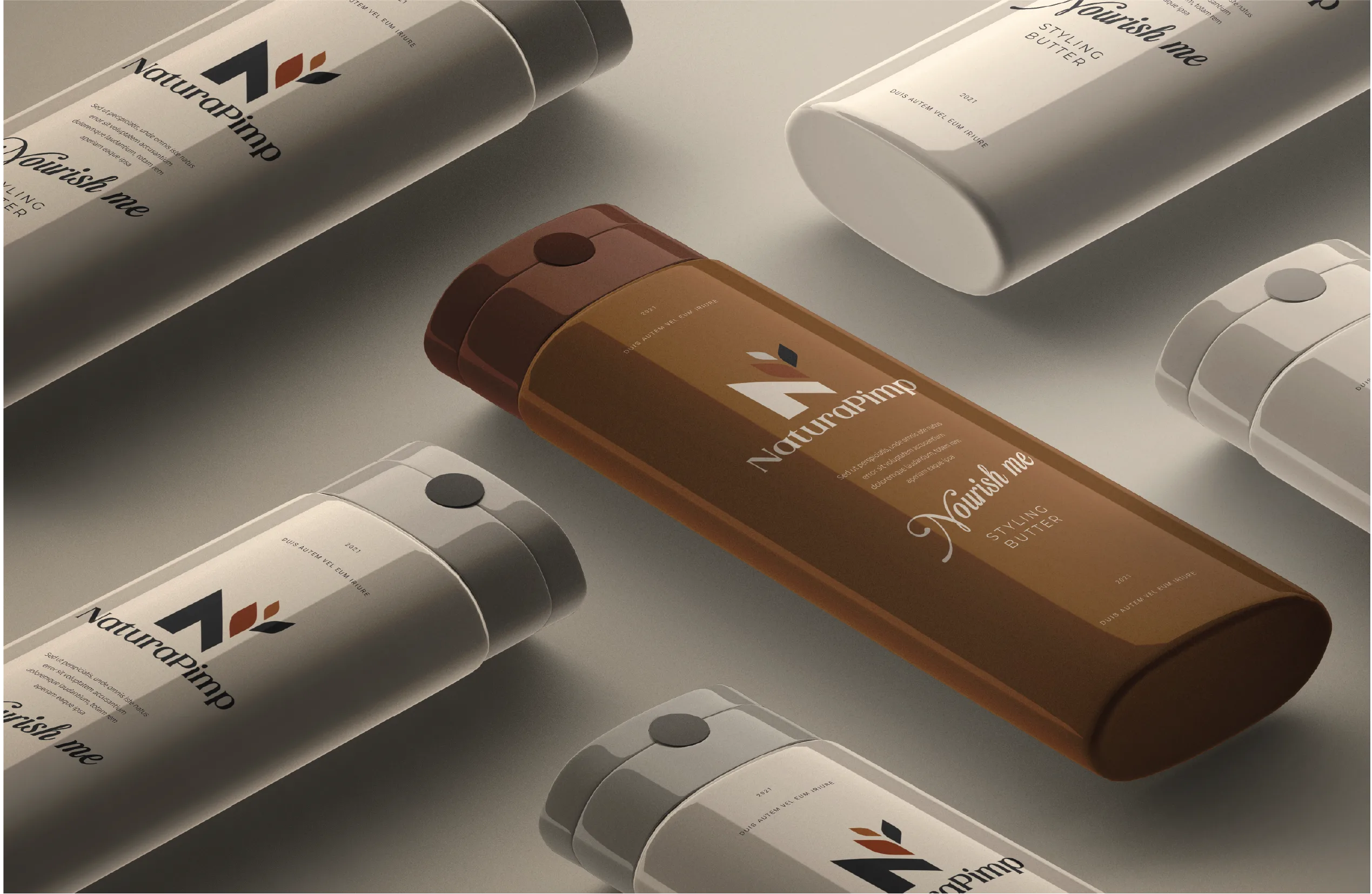
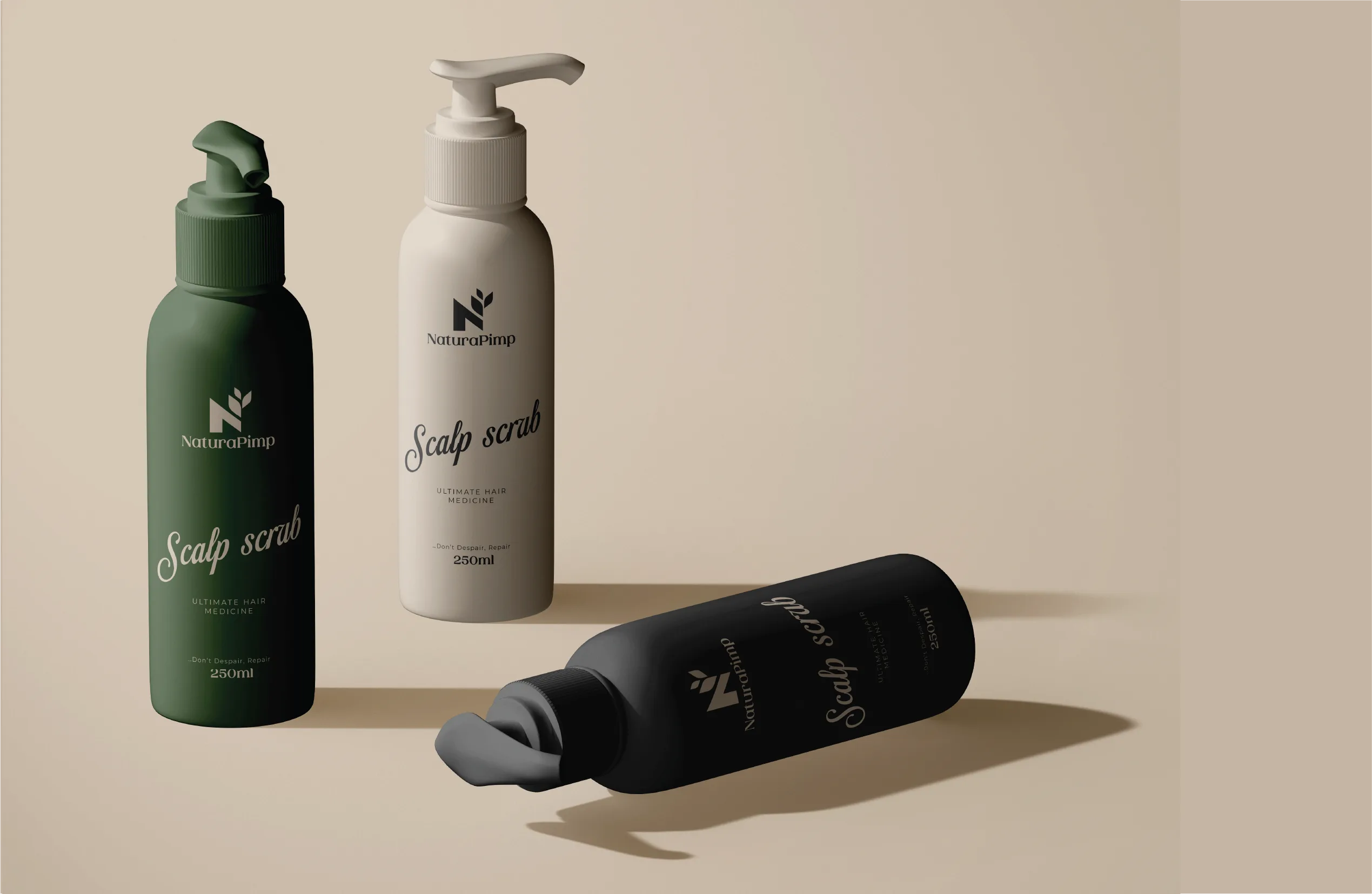
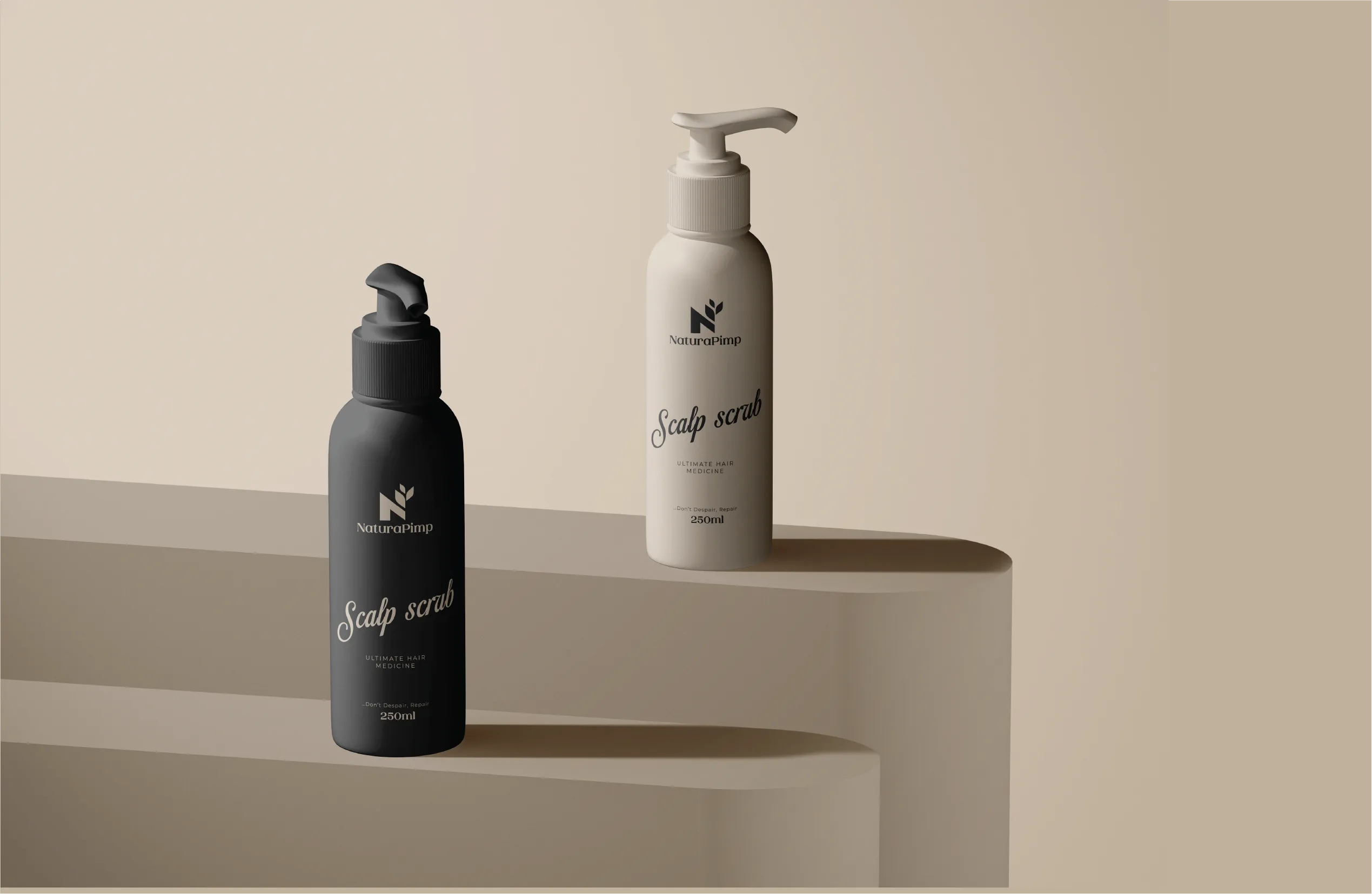
Clean typography, ingredient-forward imagery, sustainable materials. The goal was legibility at shelf speed. A skeptical customer needed to spot the difference in two seconds.
Developing Brand Guidelines
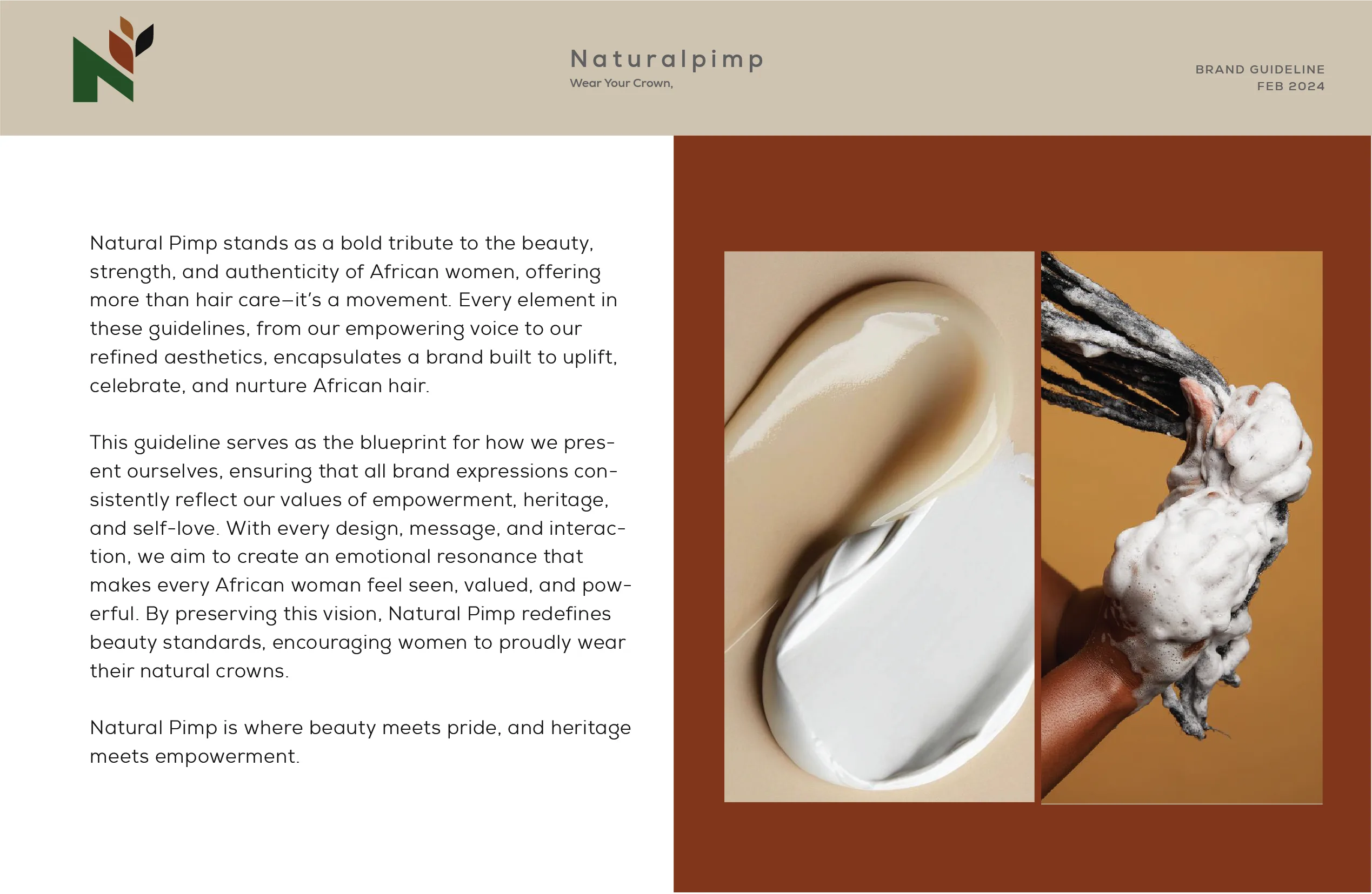
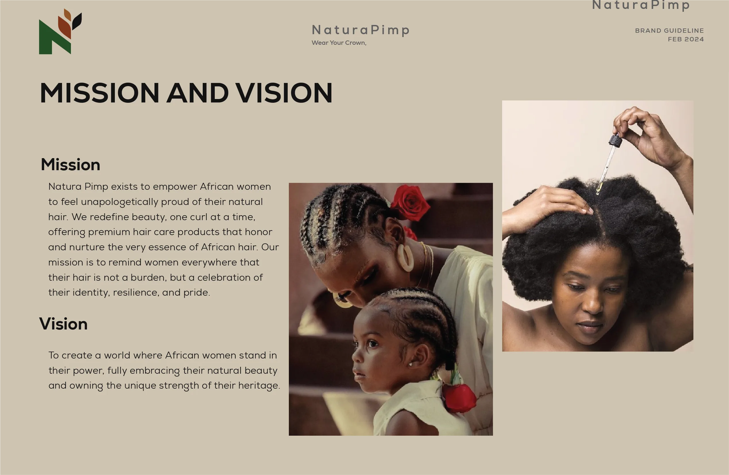
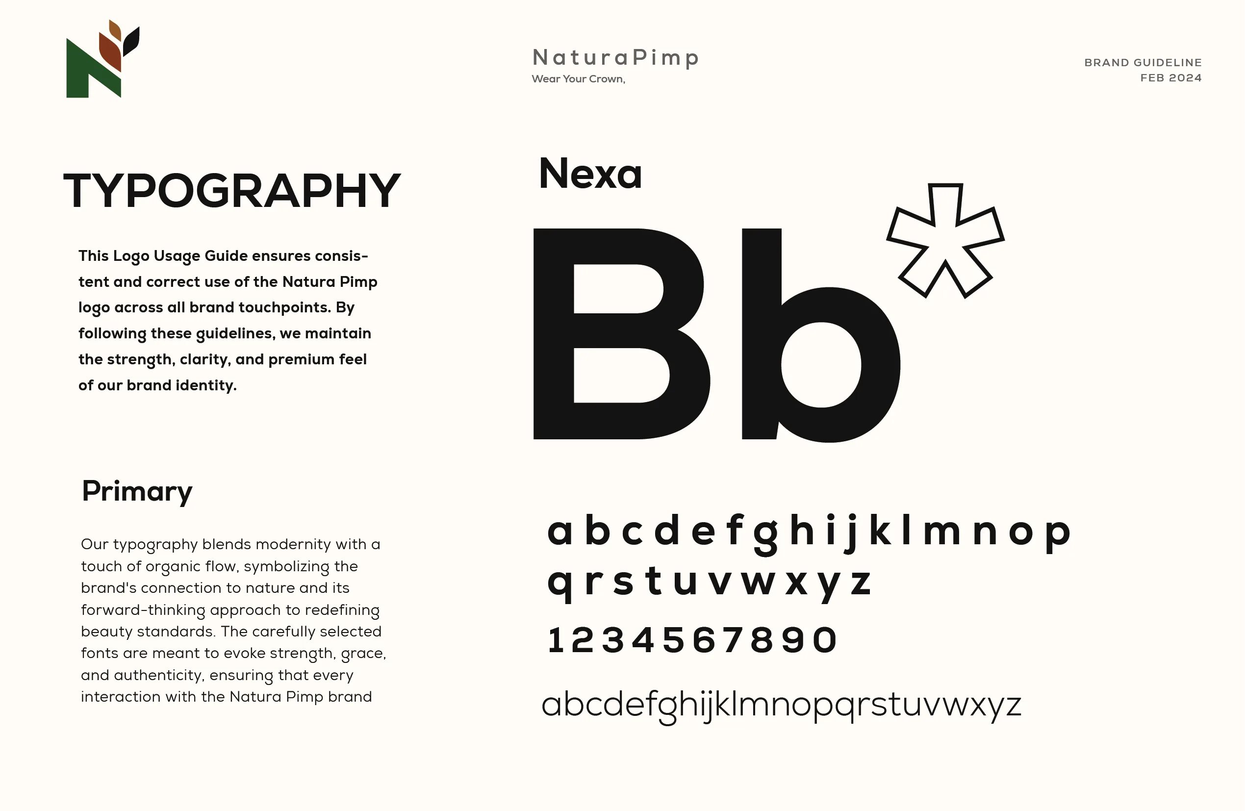
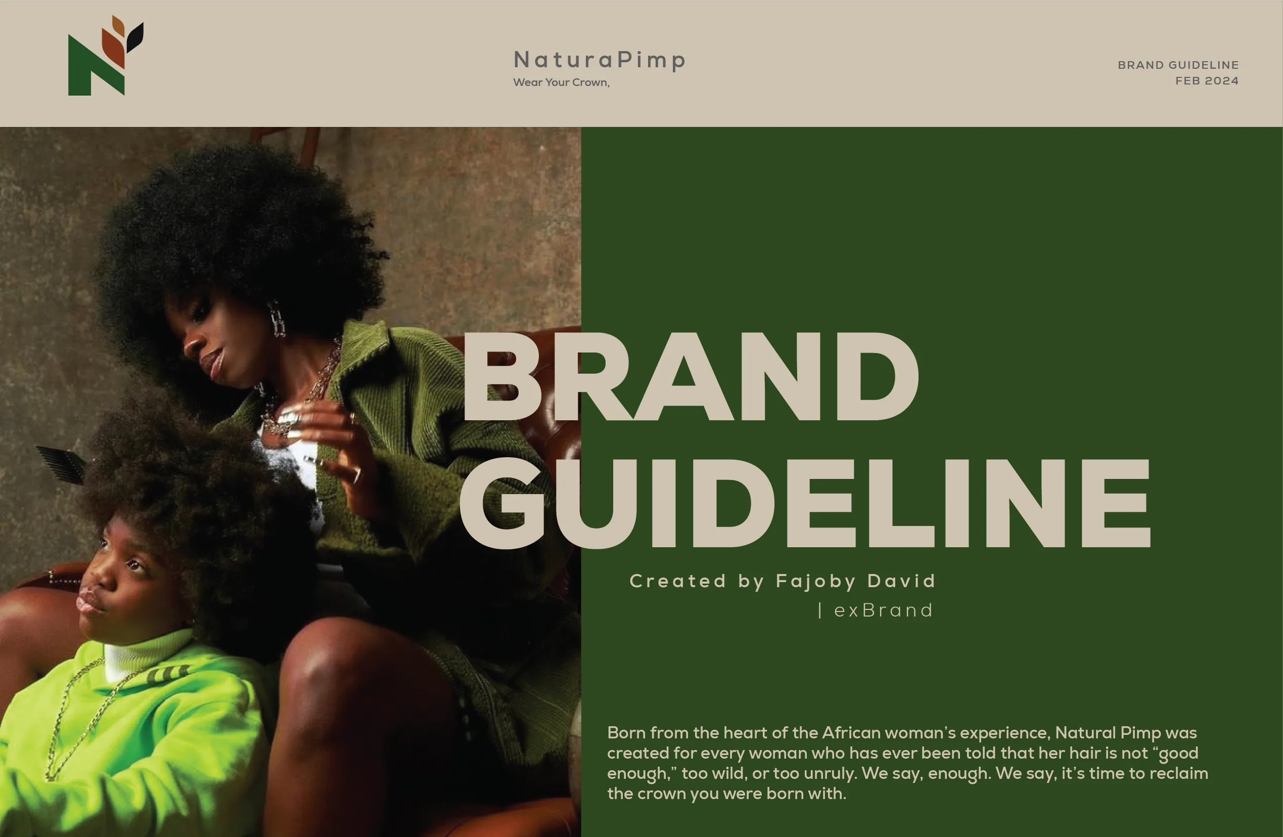
I built one reference system for visual identity, tone, and messaging. It carries the permission-not-correction idea past launch, into whatever the brand builds next.
Where This Leaves the Brand
Natura Pimp is not a haircare line with a good logo. It carries an argument: natural hair was not the thing that needed fixing. The market decides if that argument holds. The identity’s job was giving it a fair hearing.