Àbẹ̀fẹ́ – Cultural Fashion · Tasmania, Australia
Fajoby
March 1, 2020
This Is Not Fashion. It’s a Portal.
Àbẹ̀fẹ́ exists to revive what cannot be copied, culture, story, and soul. Every garment we create carries depth, designed not only to dress the body, but to awaken something within the person who wears it.
DATE: 08 OCTOBER 2023
DATE: August 2025
CLIENT: Yewande
INDUSTRY: Luxury Fashion & Cultural Lifestyle Brand
SERVICES:Brand Strategy, Visual Identity Design, Website Design & Development, ongoing Social Media Management.
The Challenge
A cultural fashion category dominated by two failure modes: Eurocentric brands with no real connection to the heritage they’re borrowing from, or heritage brands that flatten culture into “prints on clothes.” Àbẹfẹ needed a third position entirely, one that could hold real reverence and real fashion authority at the same time, launching from Tasmania, a market with almost no cultural fashion precedent to build against.
The Approach
I built the strategy around a single distinction: culture as ritual, not trend. Every part of the system had to prove that distinction, not just state it. That meant a competitor map that positioned Àbẹfẹ against Tasmania’s actual luxury and lifestyle brands, not generic “African fashion” comparisons, a proprietary design framework (S.E.L.A.™: Story, Emotion, Legacy, Artistry) that gives every future collection a repeatable test for whether a piece belongs, and a color and type system built on emotional rationale, not trend.
Visual Identity Development
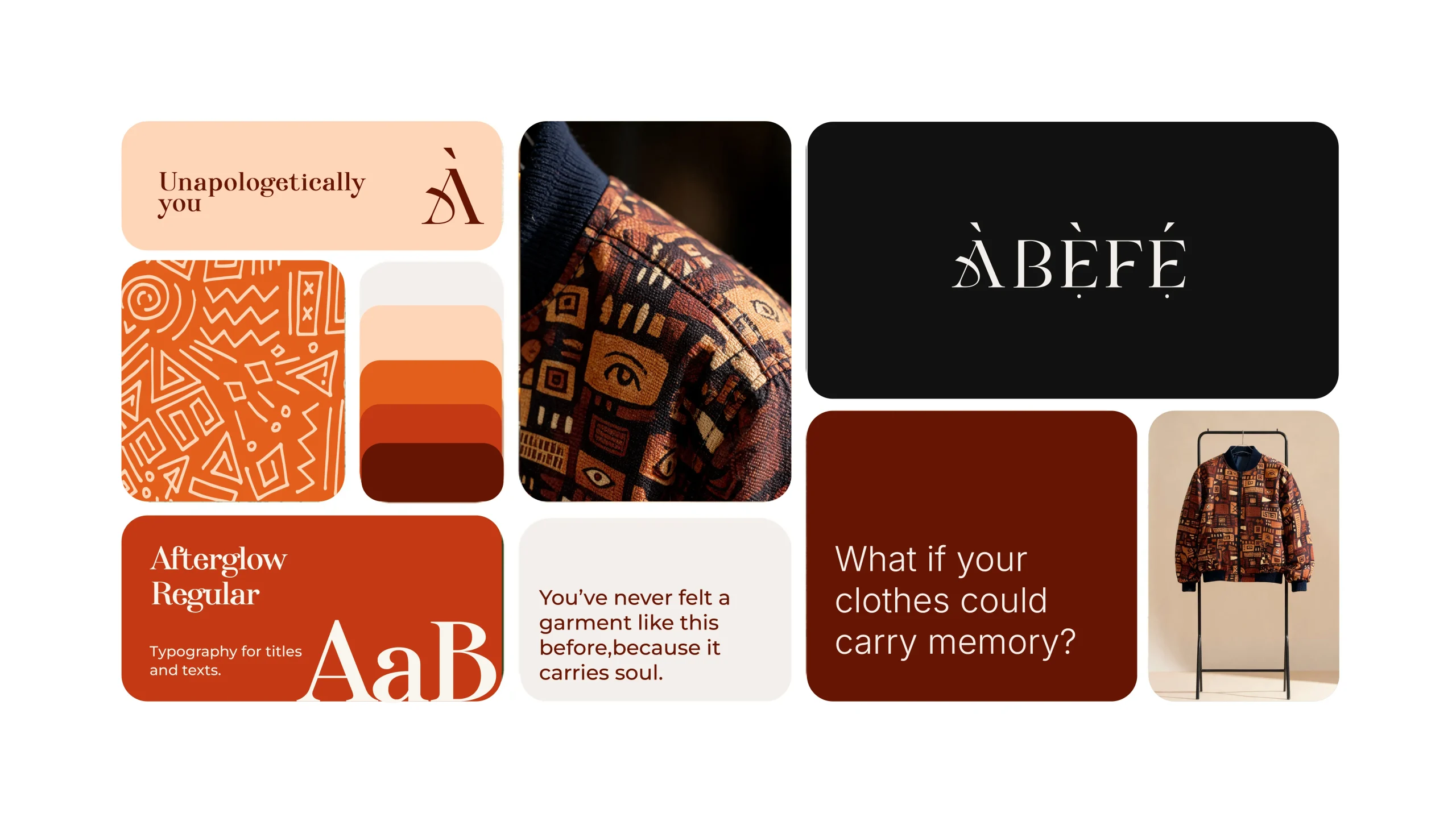
The color palette (Vermilion Ember, Fire Orange, Soft Clay Blush, Charcoal Noir) was built around one instruction: warmth with restraint. Fire Orange is intentionally used sparingly, “emotionally assertive, avoid overstimulation alone”, so the palette reads as regal rather than loud. Afterglow, the heading typeface, was chosen specifically for its high-contrast elegance, built to carry the brand’s most poetic lines (“Unapologetically You”) without losing femininity or timeless confidence to a trend-driven typeface.
A brand system either survives contact with a second collection, or it was never really a system, just a good first launch. Àbẹ̀fẹ́ has done it twice now. That's the actual test I was building toward.
FAJOBY DAVID
Brand Voice & Messaging
I built the verbal identity to match the same discipline as the visual system: a defined archetype (The Lover, supported by The Explorer), tone rules mapped by context (seductive in sales copy, playful on social, plainspoken in policy language), and a full objection-reframe library, so “it’s too expensive” or “is this just another African print brand” never gets answered off the cuff.
Social & Content
Ongoing social media management, applying the tone-by-platform rules built into the guide directly: playful and emotionally rich on social specifically, distinct from the brand’s sales or editorial voice elsewhere.
Where This Leaves the Brand
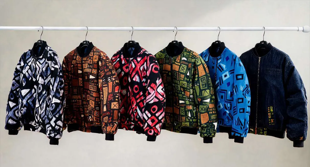
Àbẹfẹ has launched two collections since this system went live, The Becoming and The Bloom, selling across Australia from its Tasmanian base. The system’s real test wasn’t the guide itself, it was whether two separate collections could feel unmistakably like the same brand, without needing me to check every asset before it shipped. So far, they do.